Pop quiz: What’s the most important page on your website?
While most will say it’s your homepage (after all, if you can’t capture a person’s attention within the first five seconds of landing on your site, you’ve most likely lost them altogether) – I’d also add that your Contact Us page is pretty darn important! Even if a person is liking what they see, it’s on your Contact Us page that they’ll actually make that decision to reach out.
So as such, their experience on this page should be streamlined and easy as pie.
These 5 best contact page examples will show you how to do just that.
To help provide some inspiration for creating a contact page that converts, I’d like to share with you the following five examples below, as well as what we love about each. Enjoy!
1. Impact
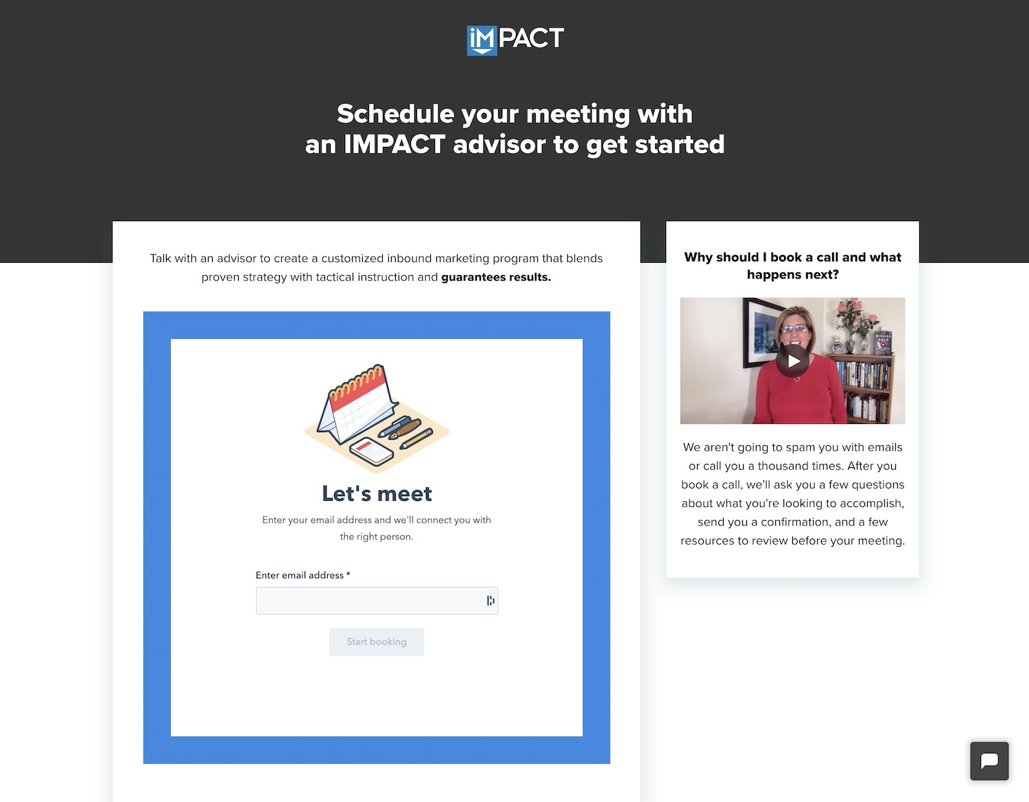
What we love:
NO DISTRACTIONS: The lack of a navigation menu at the top means zero distractions so once you’ve landed here to reach out, there’s nowhere else to go.
SIMPLICITY: All a user has to do is enter their email address to get started. It couldn’t be easier!
REST ASSURED: The friendly-faced video on the right assures visitors that a thousand spam emails are not headed their way.
Check out the Impact contact page HERE
2. YETI
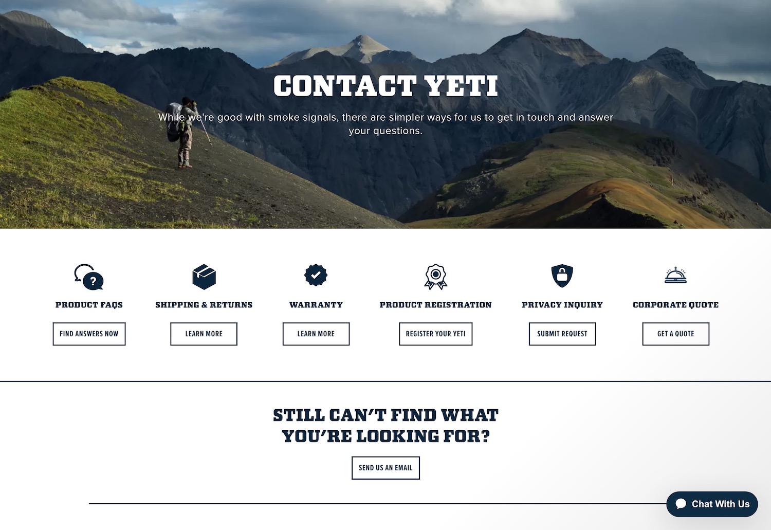
What we love:
HUMOR: The “while we’re good with smoke signals…” line beneath the page heading instills a bit of YETI’s down-to-earth and approachable brand into the page.
TIME SAVER: By providing links to virtually ALL possible things a user might be looking for, the company is not only saving their website visitors’ time – but they are ALSO saving the time of their staff. Fewer questions = fewer hours.
ICONS: The simple but fun icons above each category of help adds a heaping dose of usability and friendliness to the page.
Check out the YETI contact page HERE
3. Ban.do
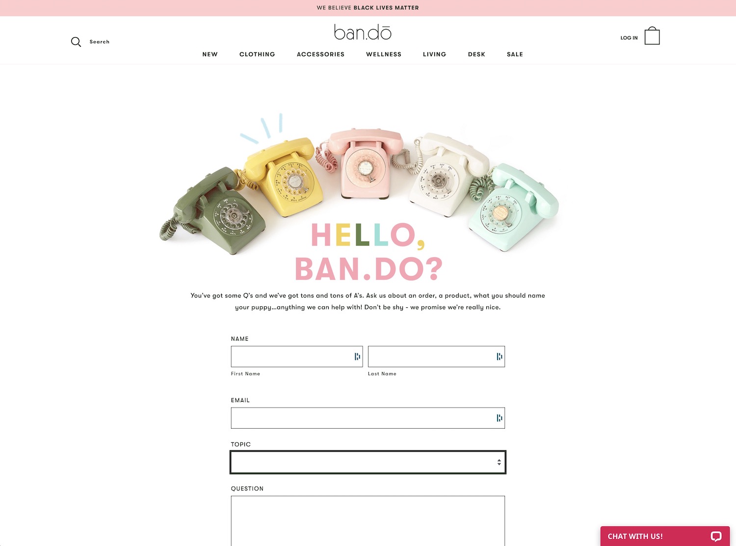
What we love:
ON-BRAND PHOTOS: It’s not hard to see that everything about the Ban.do brand is downright adorable, and so these old-fashioned phones in colors to match are simply on point.
TOPIC DROP-DOWN: Including this drop-down can both help your user clarify what they’re looking for and also help you scan for the most important inquiries in your email inbox.
CHATBOX: If you have the means to do so, a chat box is an awesome way to put any worries at bay before a person decides to reach out.
Check out the Ban.do contact page HERE
4. Grammarly
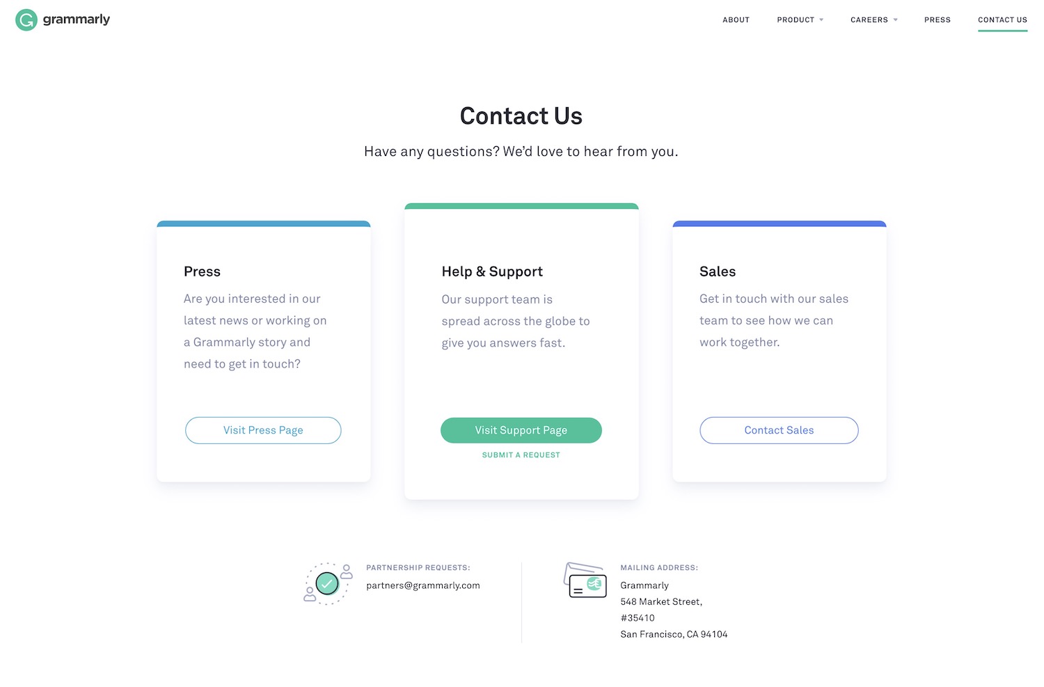
What we love:
CHOOSE YOUR OWN ADVENTURE: Because Grammarly has three distinct audiences who might be visiting this page (press writers, customers seeking support, prospective customers with questions), it works perfectly to offer a portal button for each.
ILLUSTRATIONS: The simple and slightly cutesy graphics beside the email and mailing addresses at the bottom add a fun touch.
Check out the Grammarly contact page HERE
5. Ellanyze
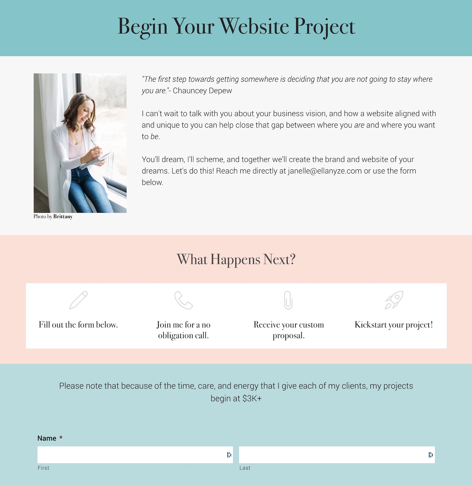
What we love:
WHAT HAPPENS NEXT: A step-by-step breakdown of what your visitor can expect after they submit the form will keep them feeling calm and taken care of.
QUOTE TO MATCH: The curated quote at the top of the page reinforces the Ellanyze brand and also sparks action.
QUALIFY YOUR LEADS: Including a starting price will ensure no one reaches out who isn’t financially aligned with your prices. This means you won’t waste their time – or yours.
Check out the Ellanyze contact page HERE
Looking for more?
If you enjoyed this post from Janelle (that’s me!) at Ellanyze, try these other quick reads:
Web Design Tips: 5 Nuances That Will Make All the Difference
Wondering What to Put in a Website Footer? Here’s 10 Great Ideas

