What to Do When Your Website Goes Down
When your website unexpectedly goes down, it can be pretty easy to freak out. But fear not! Following this easy 5 step process will ensure you’ll get it back up as quickly as possible.
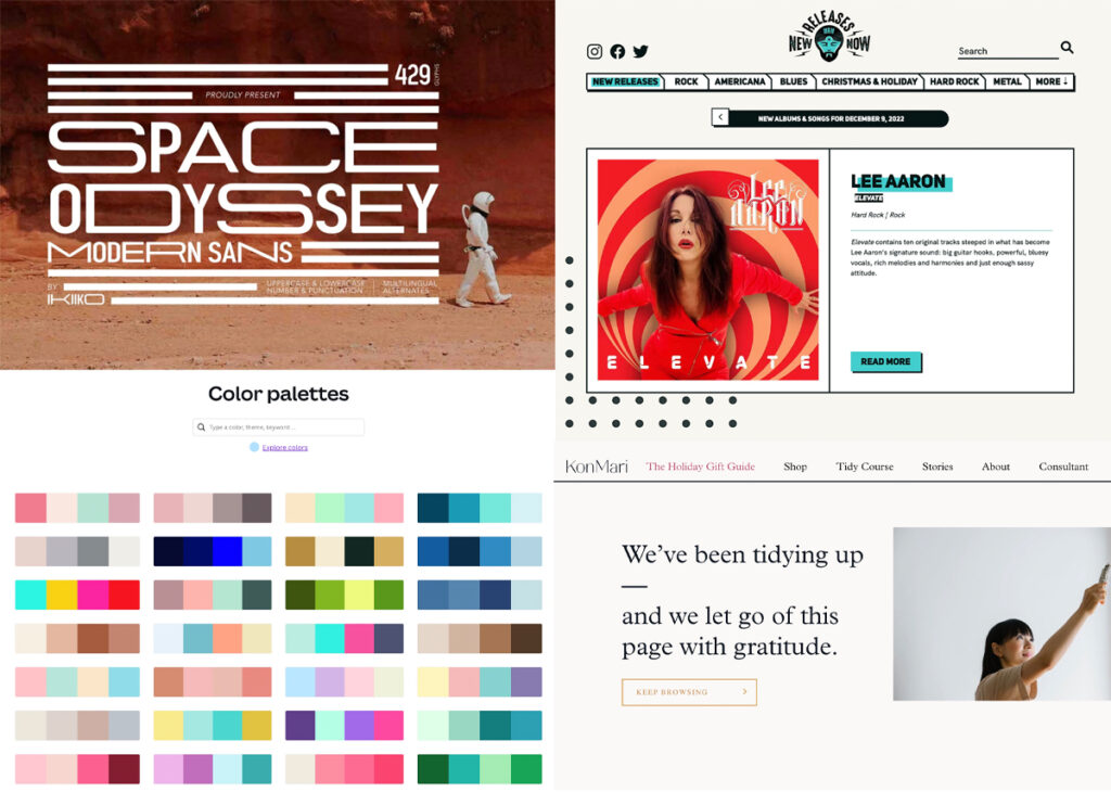
Upcoming Web Design Trends for 2023
Are you ready for one of my most popular blog posts every year? Great, me too. Get ready for what’s coming to websites in 2023.
5 Ways to Make the MOST of Your Holiday or New Year’s Sale/Promotion
Holding some kind of sale or promotion around the holidays or new year can be a GREAT way to drum up new business. Once you decide on yours, here are 5 ways to make the MOST of it on your website.
5 Steps to Hiring the Best Designer for YOU
Hiring a professional designer (a web designer, logo designer, or something else) can be a daunting task. Here are five tips to help you hire someone you’ll feel GREAT about from start to finish.
6 Ways to GROW Your Email List Via Your Website
Ask any business owner if they’d like to grow their email list and the answer you’ll get is YES … but how do we do it, and more importantly, how can our website help? Follow these six best practices and watch your subscriber numbers rise.
Icons: Why They Rock, and When & How to Use Them
Icons are a bit of a “secret weapon” in web design: they allow your visitors to absorb MUCH more of your content, and best of all they’re FREE and easy to use. Learn where to get them, and when and how to use them below.
5 Things That Should Be On Your Website Homepage
You might have all these items on your website … but are they on the homepage? If they’re not, they may be getting missed – not good. Now isn’t the time to save the good stuff for later. Let’s get those gems front and center where they belong.
Web Design’s Dirty Little Secret (If Your Website Has a Rotating Carousel Slider, READ THIS)
It’s time you learn the dirty little secret of website design. Those rotating sliders that everyone loves because they allow you to put multiple items at the top of your homepage? They’re not as great as you’ve been led to believe. Read on to learn more.
3 Ways to Avoid (Ugh) Broken Links
Nothing says “unprofessional” like broken links on your website, so let’s get to fixing them, shall we? Here’s how to find them, correct them, and in many cases avoid them in the first place!


