I’m going to let you in on a little secret. When visitors come to your website, they don’t read your paragraphs of text from beginning to end.
Instead, they SKIM.
And astoundingly, this one single behavior that virtually all website visitors do is what’s behind most of my practices when it comes to setting up web pages.
This is how you can tell the difference between a DIY website (set up by its business owner) and a professionally made website (set up by a pro such as yours truly). It’s long paragraphs of text versus text that has been broken up into skimmable chunks including headlines of various sizes, bullet point lists, and – you guessed it – text accompanied by icons!
Herein lies why icons ROCK: it’s because they make your content skimmable, allowing your visitors to take in more of what you’re trying to communicate, which is a win for everybody. It means fewer annoying questions for you the business owner and less confusion for your prospective clients.
Where can I download free icons?
My go-to website for free icons to download is flaticon – and freeicons.io is also a good choice. You’ll notice that both of these sites list icons that are free as well as icons that are only available with their premium plan. You can filter your search results so they only include free icons.
When should I use icons on my website?
Icons are great, but it doesn’t make sense to use them just anywhere. So where should you use icons on your website?
Any time you have content that lists things out is a perfect time to use icons. For example, are you listing out the benefits of your services? Or listing the instances when your product is a great fit? Or listing your company’s core values? Any of these instances are perfect places to use icons that accompany your text.
Let’s take a look at a few examples to illustrate what I mean.
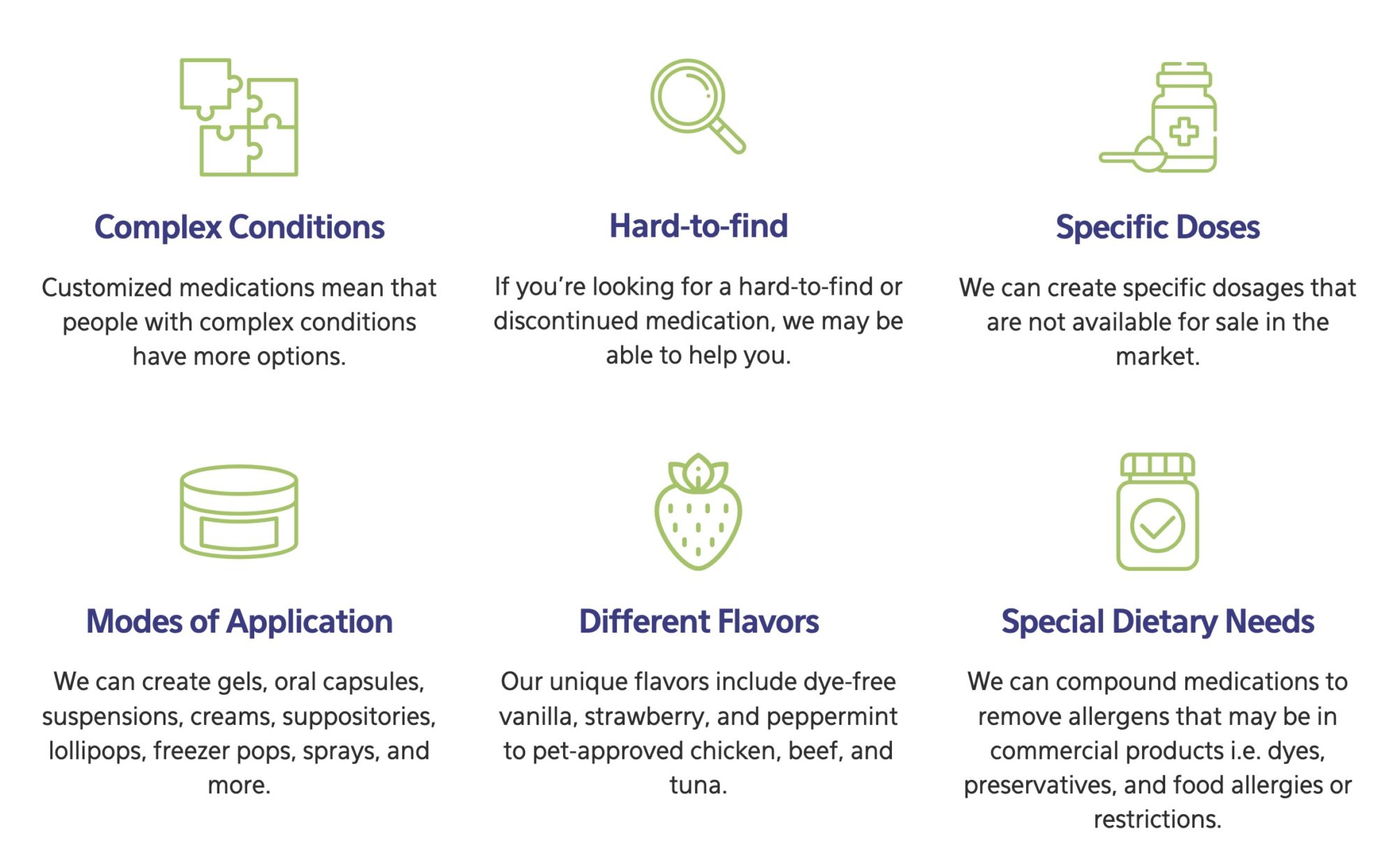
This first example is from Clark Professional Compounding Pharmacy. We used icons to help communicate to visitors some of the instances when a compounding pharmacy might be needed.

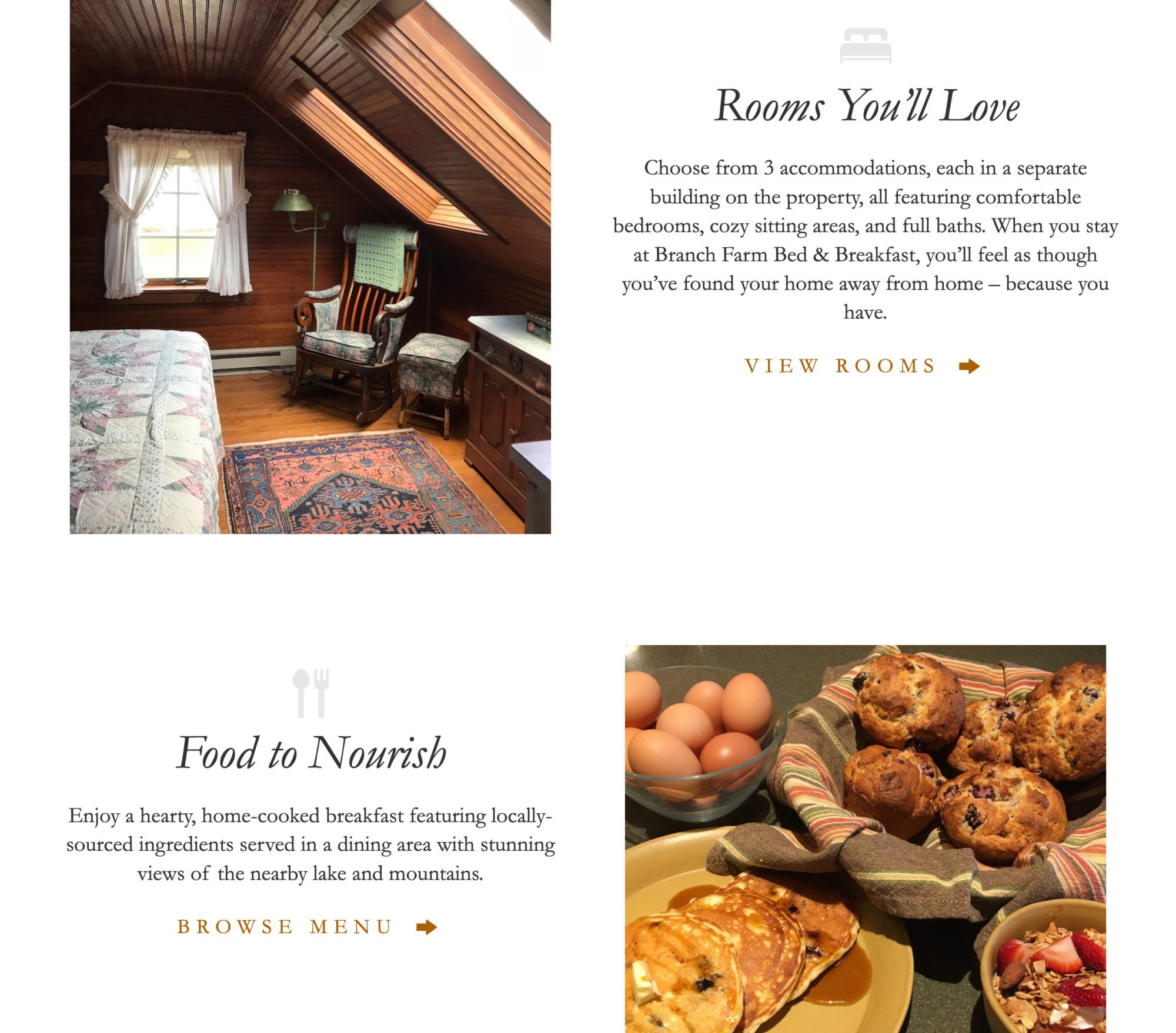
This next example is from Branch Farm Bed & Breakfast in the Adirondack Mountains. On their homepage, we used icons to reinforce what makes their inn unique. The effect is subtle, but the icons definitely help to communicate to the visitor in a non-verbal way.

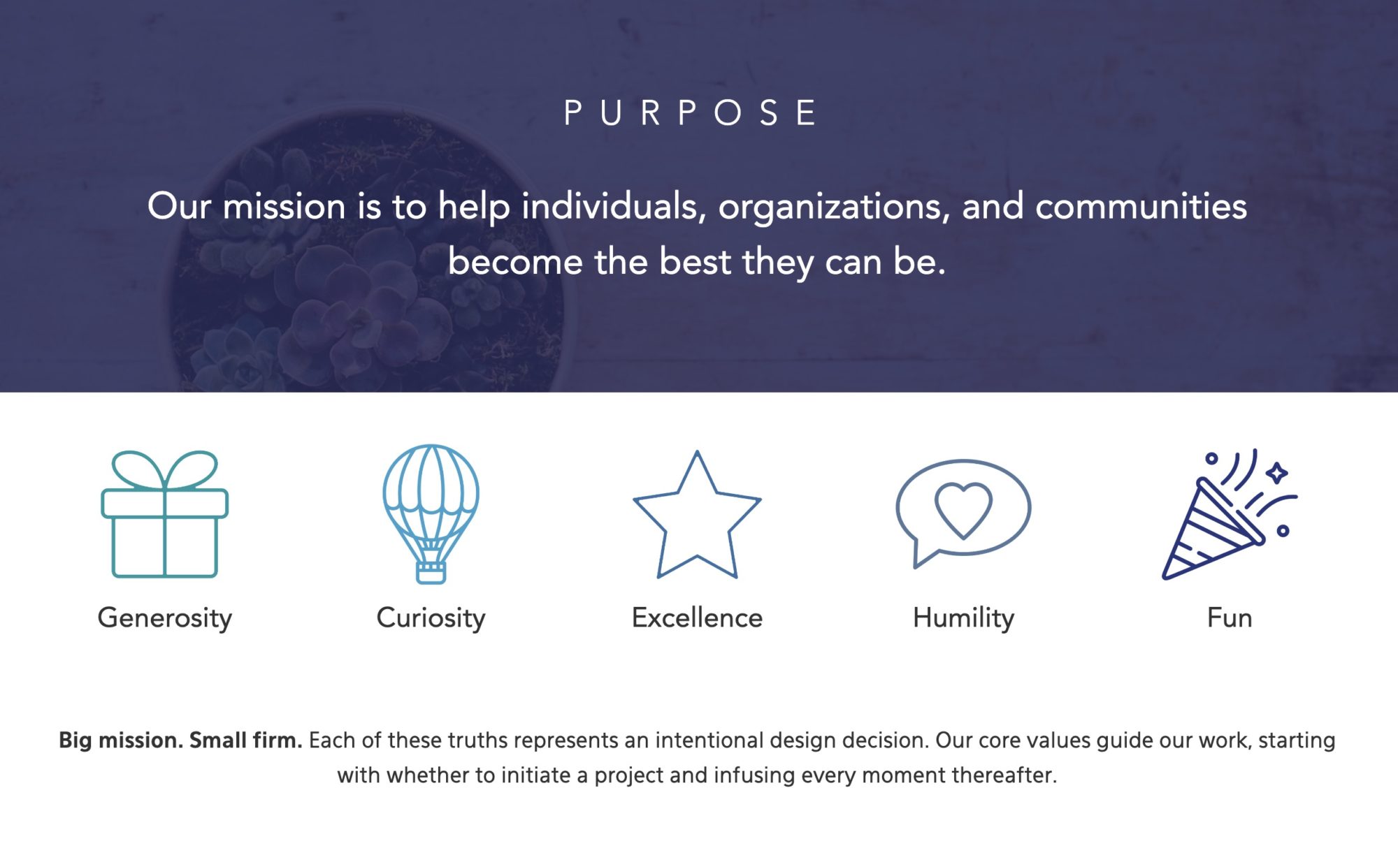
And this last example is from Bridgeport LLC Consulting Group. We used icons to better present their five company core values. Best of all, the icons help to convey FUN, one of their values!

More tips for picking out and using icons
When you’re browsing icons, take into consideration the following:
- You’ll notice that some icons are in color and others are in black. I would recommend you opt for the simple black icons for better visual consistency across your icons.
- Similarly, you’ll notice that some icons are filled in (like the Branch Farm Bed & Breakfast example above), whereas others are not filled in (like the Bridgeport LLC example above). Choose either ALL icons that are filled in or ALL icons that are not, again for visual consistency.
- If you are opting for icons that are not filled in (i.e. drawn with lines) try to choose icons that have a similar line width, as this can vary from icon to icon.
Remember, the more stylistically consistent your icons are, the more professional it’s going to look.
Can I change a black icon into a color of my choice?
Yes and this is a wonderful idea! I’m a fan of putting icons into colors that match a website’s overall theme and a company’s brand. I myself use Photoshop to change the colors of icons, but a good online free tool is Change PNG Color at Online PNG Tools. Here are your steps:
- Drag and drop your PNG onto the space provided
- Select black above “Replace this color…”
- Select your color of choice or paste in your hex code above “…with this color”
- Download your newly colored PNG via the “Save as” link
Voila! Now your icons match the style of your website and are ready for use.
Looking for more?
If you enjoyed this post, here are some other fun reads on website design DIY from Janelle (that’s me!) at Ellanyze:
15 Creative Prompts For a Stellar “About Me” Page

