News flash! Your contact form on your website is important.
What’s that you say? You already knew that?
Ok great … BUT did you know that not all contact forms are created equal? Some will get a LOT more submissions than others depending on many factors. And that’s what today’s post is all about. Keep reading to get your website contact form in tip top shape so you can get as many form submissions as possible.
(Because hey, after all, getting new customers is what having a website is ALL about. And your contact form is exactly where that happens.)
As a bonus, I’ll also include four examples of contact forms I love and why so you can get inspired to make yours uniquely you. Let’s go!
Tip #1: Use JUST as many fields as you need – no more, no less.
Have you ever filled out a form online and wondered to yourself why on earth they needed your birthday or some other piece of information? We all have, and that’s exactly what you DON’T want your visitors thinking.
The way to do this? Give them precisely as many fields to fill in as pieces of information you need – no more and no less. Of course you’ll need their name, email, and message – but consider carefully as you add more. For example, if you’re asking for their phone number (or anything else), know your reason why and make sure it’s a good one.
Tip #2: Consider what fields are required versus not.
Most of us intuitively know that fields marked with an asterisk (particularly a red one) are REQUIRED to fill out in order to submit the form. When a site visitor is filling out a form and comes across a required field that they simply don’t have an answer for (maybe it doesn’t apply to them), they’re likely to get frustrated. Make sure that whatever fields are required will apply to ALL your users.
Tip #3: Tell visitors what happens next.
After someone submits your form, THEN what happens? I always like to say: take the mystery out of everything. People don’t like to wonder – they like to know. Should they check their email for next steps? Can they expect to hear from you within 2 business days to set up a Zoom meeting? Whatever happens next, tell them in simple terms so they can feel assured and prepared.
Tip #4: List your fields from easiest to hardest.
Did you ever notice in school that the hardest questions on the test were never first? There’s a reason for that. Ease your site visitor into filling out your form and make it easy. Start with the easiest questions – like their name and email – and end with the questions that will make them think – like how they found out about you or what exactly they need help with.
Tip #5: Perfect your button!
Make your submit button irresistible. Here’s how: 1) Avoid the word “Submit” and instead opt for something with more personality like “Let’s do this!” or “Request a call” and 2) make it big, colorful, and beautiful.
Bonus Tip: Always test.
Always test your contact form. Always test your contact form. Always, always, ALWAYS test your contact form 🙂 Your business depends on it.
Ok, so now that you’ve got five (six actually) must-have contact form tips under your belt, take a look at these stellar examples of contact forms I found out among the interwebs, and get inspired to up your own game.
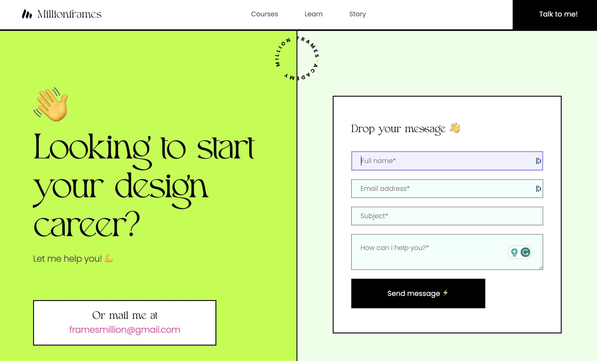
Example #1: Million Frames UX Design Courses

What I love:
- What does this scream? FUN! The colors make it engaging and lively.
- When you click on any field, it turns from green to purple.
- Asterisks tell you that all fields are required.
- The lightning emoji on the send button adds a subtle but fun touch.
Example #2: Dija Ouija

What I love:
- Simple is the name of the game. The website owner decided that a person’s name, email, and message are enough.
- The social media icons above the form communicate that if a person prefers to reach via Facebook Messenger, etc. that’s a-OK.
- Asterisks communicate which fields are required.
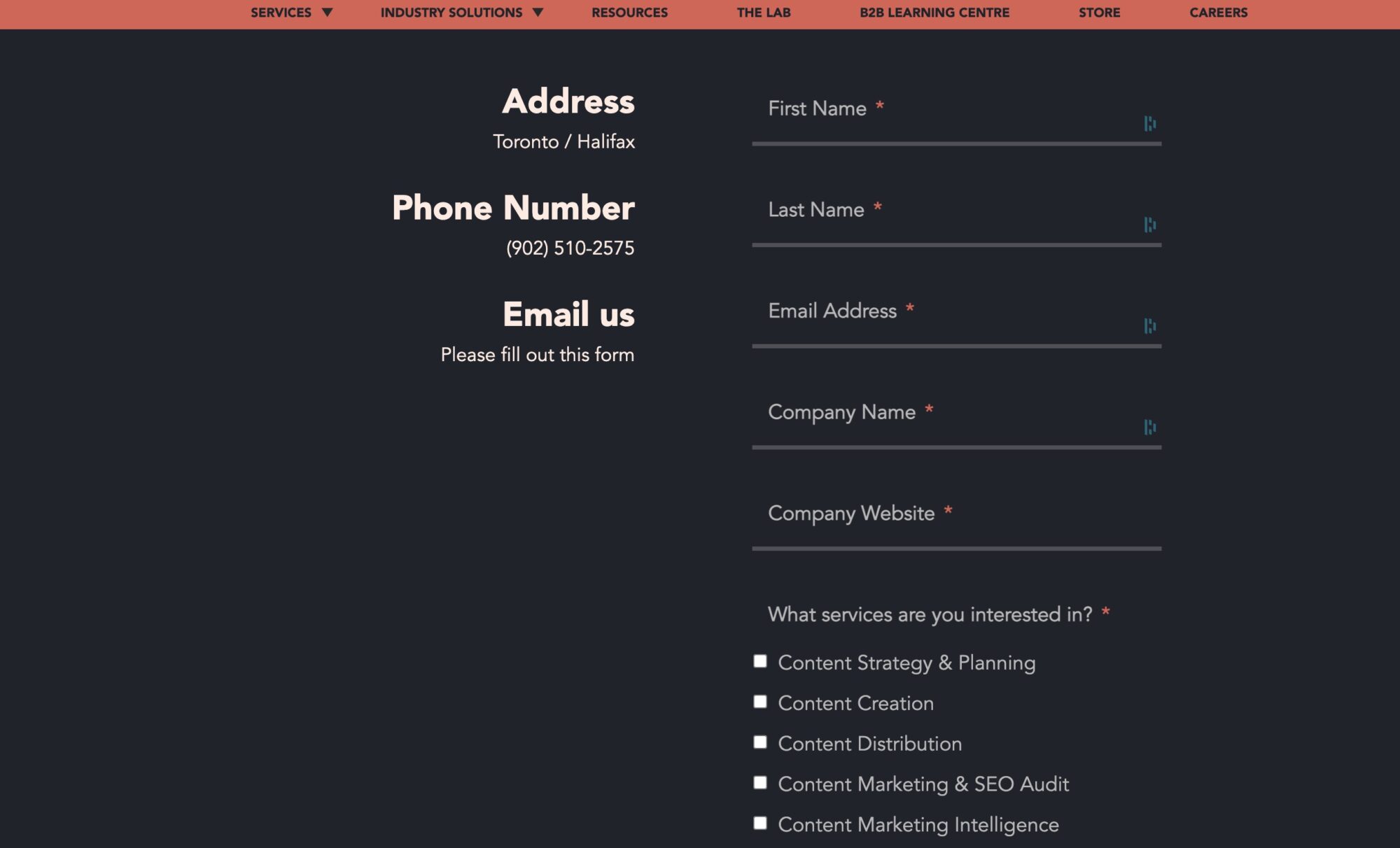
Example #3: Foundation Inc.

What I love:
- The asterisks are red and they really POP making it easy.
- They masterfully ranked the questions in order from easy to hardest, ending with the most fun question of all – budget 🙂
- An open message space is at the end but NOT required in case they don’t have anything else to say.
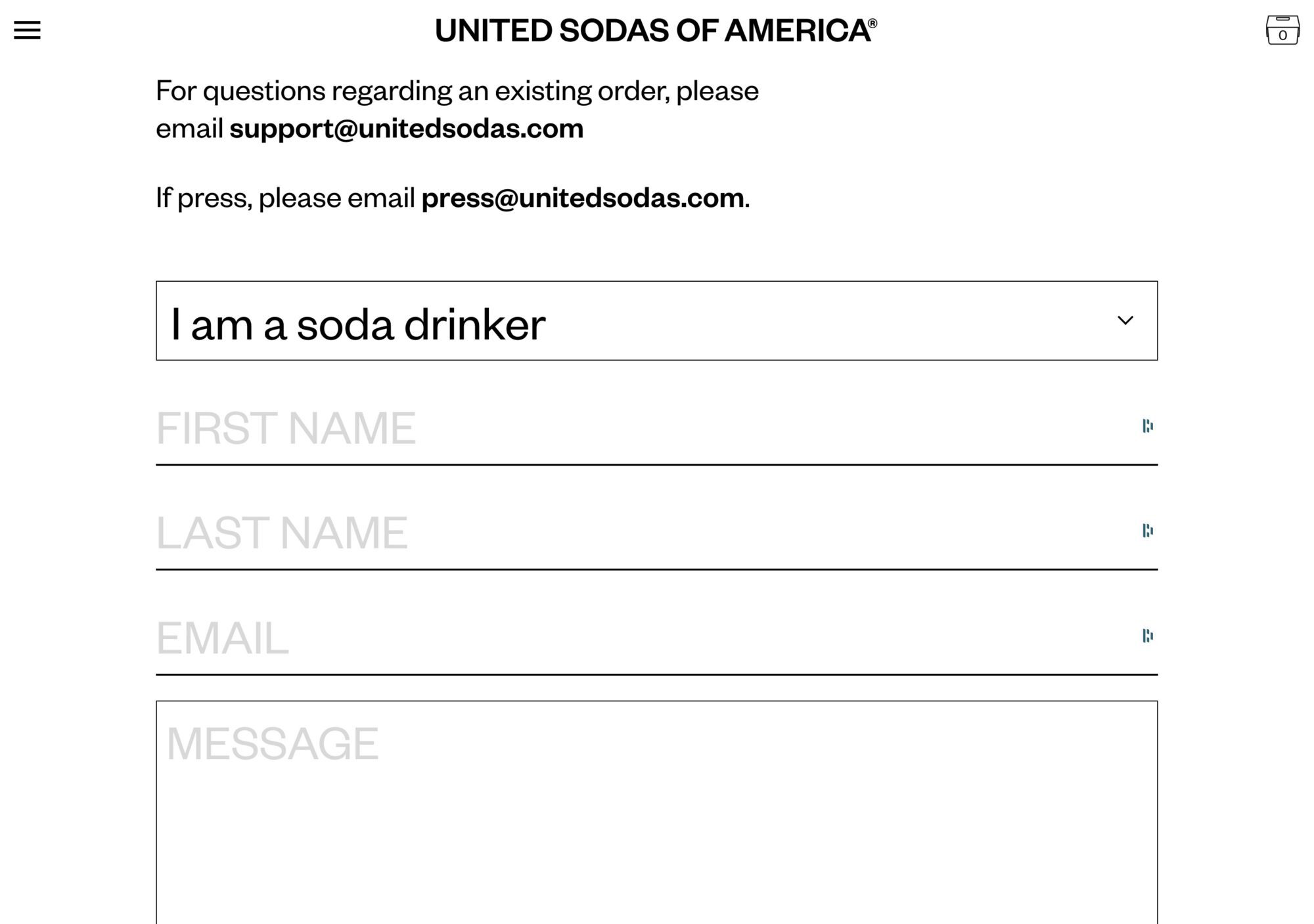
Example #4: Sodas of America

What I love:
- Hey, that’s some large text. Easy to read for all.
- I love the dropdown in first person i.e. “I’m a soda drinker” or “I’m a retailer”.
- Directly above the form are two email addresses to write to for specific things, making sure all inquiries go to the right place.
- The contact form is at the bottom of the FAQ page – genius! If someone can find an answer there, they will and that means fewer emails for the site owner to read.
In Closing
Your website contact form isn’t just important – it’s SUPER important! It’s where your interested website visitor makes the decision about whether to reach out or leave your site and maybe never think about you again.
So get it right. Follow the tips above and use the examples as inspiration to make a form for your website that ROCKS! 🥳
Looking for more?
Here are some other quick reads from Janelle (that’s me) at Ellanyze on improving your contact page.
5 Best Contact Us Pages & What We Love About Each
The 5 Secrets to a Successful “First Call” With a Prospective Client


This is good points for a prospective client. I struggle with clients giving me one day notices. I reach out and ask to change the day or time if I have a conflict. Your tips were very helpful!
I’m glad this was helpful Elizabeth! I agree, it’s frustrating when clients don’t give you much notice to cancel or move meetings. What I’ve done in the past is if a person does it many times, I might tell them we’re not a good fit to work together and they might be a better fit with someone who is more comfortable moving meetings last minute 🙂