What purpose does a website footer serve, anyway?
Well, every page has to end *somewhere* and your website footer is exactly where that happens.
(Unless, of course, you’ve found yourself in the grips of an infinite scroll, in which case, good luck!)
The way I see it, a website footer serves two primary purposes:
1) It gives your user one last, final chance to see something of interest or need, so they continue their journey on your website without leaving empty-handed and
2) It now also serves as a place where users typically know they can find bits of information such as a phone number, address, Instagram link, or something similar.
So, as they say, give the people want they want! 😀
Ready to get inspired as we look at three creatively awesome website footers, which as it happens, all come from women-founded & led companies. YES!
Example #1: Goooders
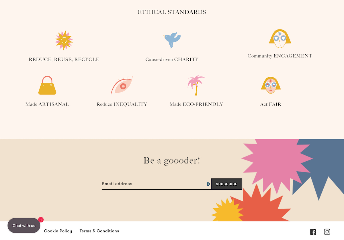
Founded by former fashion editor Eva Geraldine, Goooders is a conscious and luxurious shopping experience for travelers.

What do I love about their website footer?
- They list their seven core values as a company, each with a beautiful little on-brand illustration. Win!
- Their social media links are listed there so if someone is looking for them they can find them, but they’re teeny tiny because – hey – don’t leave the website, please!
- Taking a minimalist approach, they’ve kept the links to just the crucial: Terms/Conditions, Cookie Policy, and Chat with us.
- They’ve made their email list sign-up a TOP priority (at the bottom that is), and it’s near impossible to ignore with four colorful suns bouncing around the screen in a way that will never repeat itself. SO cool (check it out via the video below).
Example #2: Period Aisle
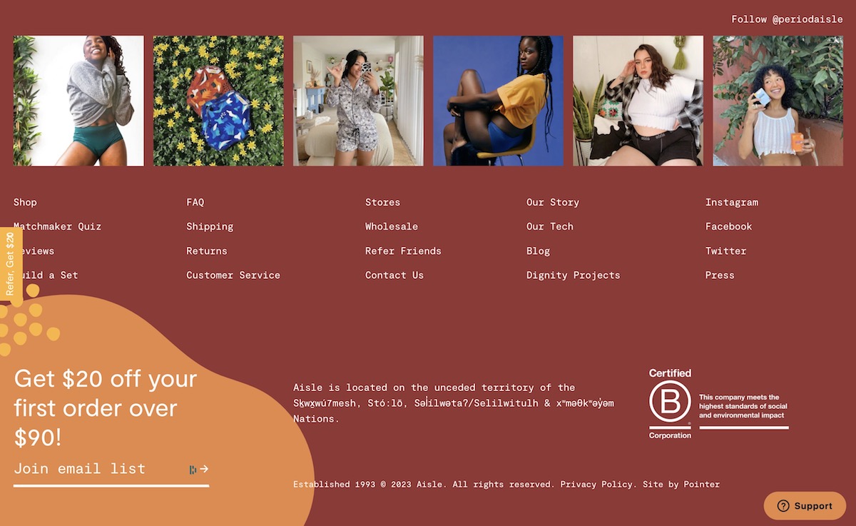
Founded by friends Suzanne Siemens & Madeleine Shaw, Period Aisle provides leakproof period underwear in a wide variety of sizes for all body types.

What do I love about their website footer?
- Instead of systematically bringing in their latest Instagram posts (not that there’s anything wrong with that), they feature a collection of six curated photos from IG that best reflect the inclusive we-love-all-body-types aspect of their brand. Love. Any photo, when clicked, takes you to their IG account to continue perusing.
- In case you’re not ready to call it quits, they elegantly list 20 different links around the site – everything from the “Matchmaker Quiz” (yes please) to Our Story.
- Rather than display social media icons, as is the norm these days, they simply list the platform links via text. Sort of refreshing not to have to see those darn social media icons yet once more, isn’t it?
- They’re a Certified B Corporation (which, if you’re not familiar, is a big deal).
- In a lovely period-like orange “blob” is their email list sign-up, which gets you $20 off – brilliant!
Example #3: Collective Measures
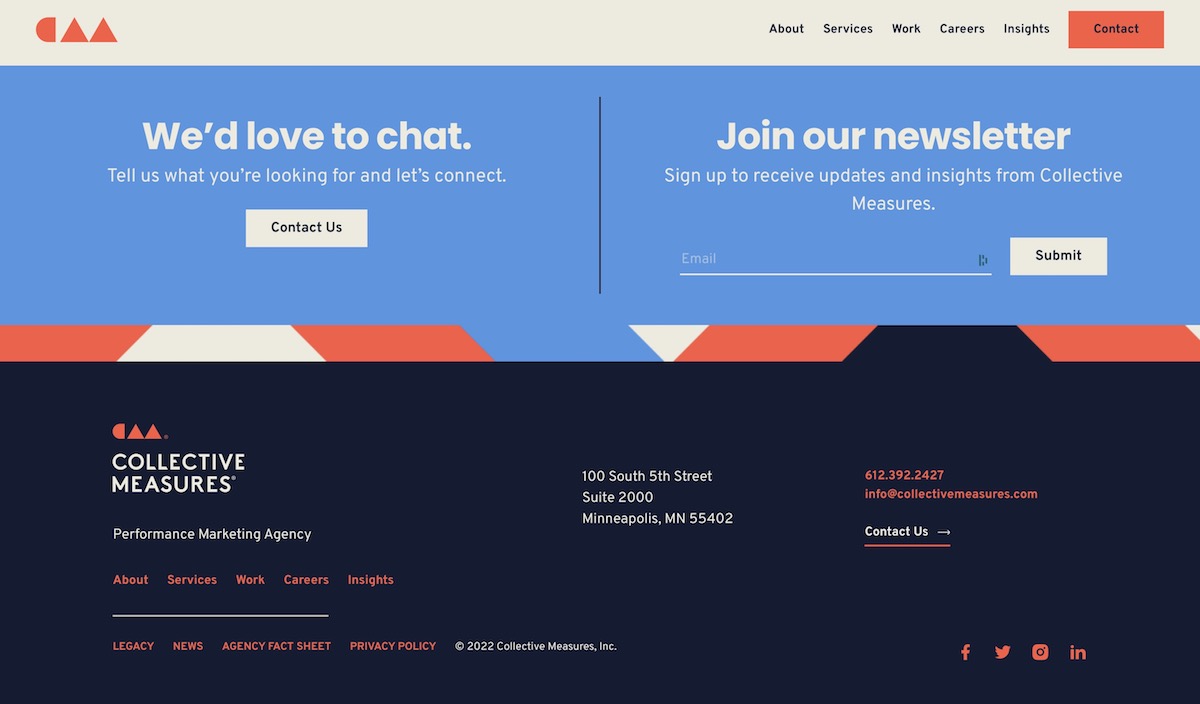
Founded in 2005 by Nina Hale as Nina Hale, this marketing agency rebranded years later to move away from one single persona to (quite literally) a collective pursuit. Collective Measures is based in Minneapolis, MN.

What do I love about their website footer?
- Perfectly framed by its sticky header which never goes away (love it), this website footer takes up just the right amount of space in a browser.
- Its colors and design seem somehow reminiscent of a postal stamp, which I love.
- They’re prioritized two primary call-to-actions: one, start the conversation as a prospective client and two, if you’re not quite ready for that, join the newsletter instead so you don’t forget about them!
- Again, teeny tiny social media icons are there if needed, but nowhere near the focal point of the page.
- Their address, phone number, email address, and contact us link are also easy as pie to find.
Special Mention
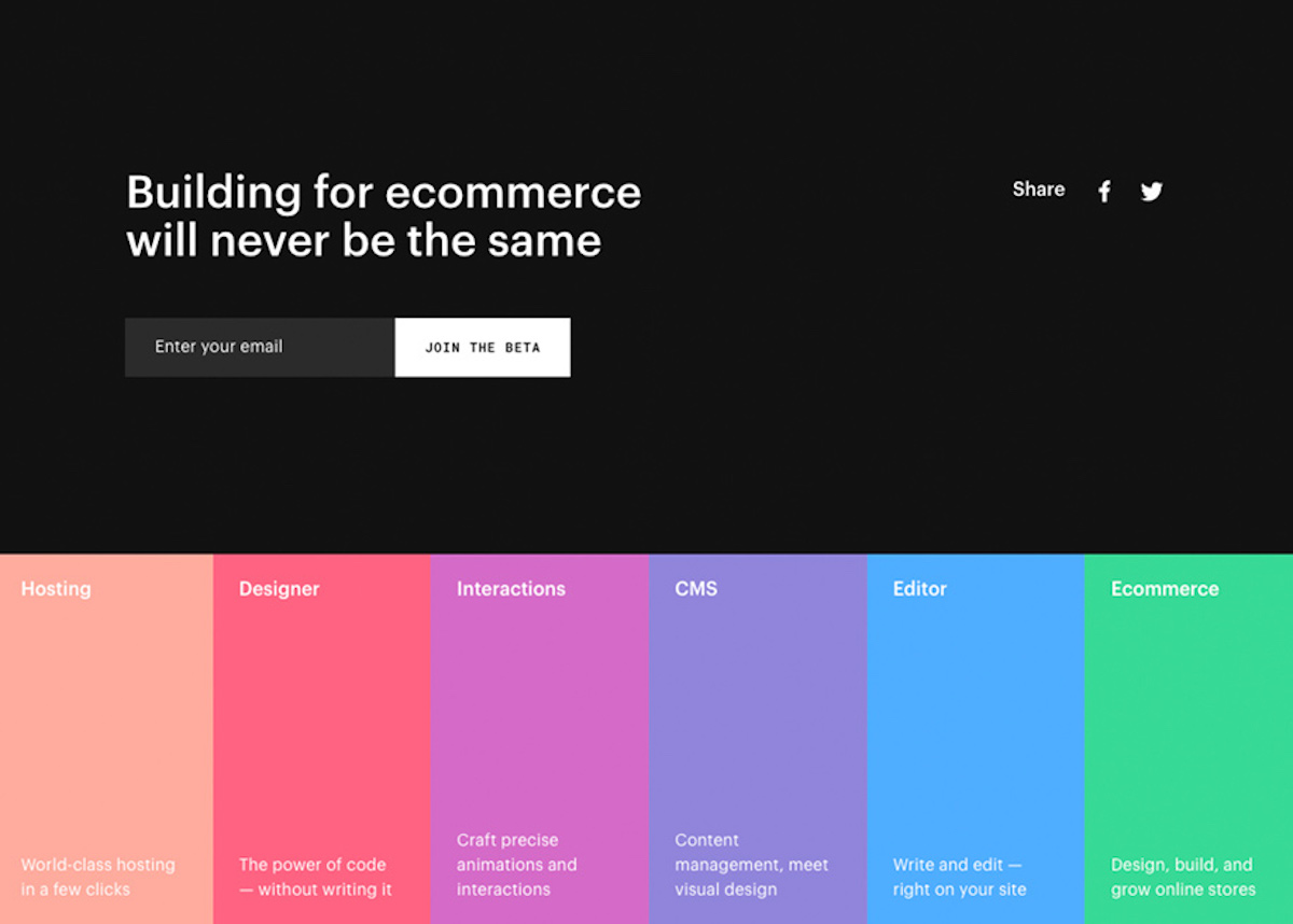
I found a screenshot of this rainbow-colorful website footer which is sadly no longer used on a live website – but it sure was pretty. You just can’t beat those bright and colorful buttons, am I right? I love color palettes, and this design found a clever way of getting that palette right onto the page. Sort of reminds me of a landing/splash page I designed for Bridgeport Consulting LLC some years ago.

In Closing
While a website footer may be the very last thing on the page, it certainly doesn’t have to be the least.
Take some inspiration from the creative website footers above to add a little pizzazz to your website footer. Your users will thank you!
For more on website footers, check out my previous post, Wondering What to Put in a Website Footer? Here are 10 Great Ideas.

