Ok, I confess – this is one of my FAVORITE blog posts to write all year long 🙂
I mean, what’s not to love? Learning about design trends that are coming up in the new year? Are you kidding me? Call me a design geek, but this is PURE FUN in a bottle right here.
So let’s get to it! Here’s what you can expect to see more of online in 2022.
Which will you implement on your website? The sky is the limit.
1. One Page Websites
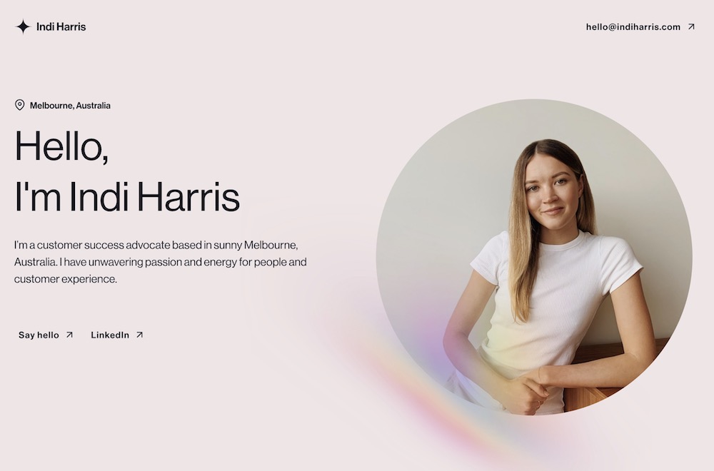
Sometimes – just sometimes – all you need is one page. Are you a solopreneur who just needs a landing page with a few examples of your work and links to your email and LinkedIn profile? Or are you a band that just needs a page with links to all your social and music listening platforms? A one-page website might be for you. Check out Indi Harris who did it beautifully (and you gotta love that rainbow tint).
2. Full-Screen Video
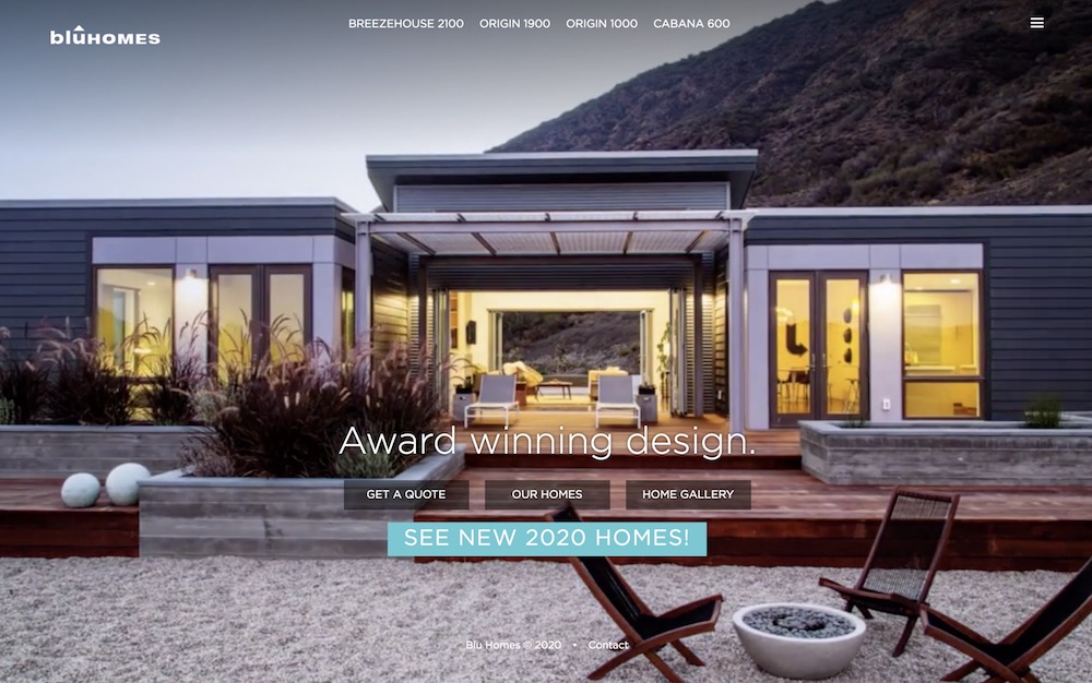
Nothing transports you to another place like a full-screen video, and it’s no wonder why. The downright immersive quality is hard to beat. For example, the Blu Homes website (pictured below) has a time-lapsed video that takes you to a view of one of their homes from dawn to dusk. What kind of video would show your visitors what you’re all about?
3. Big Text – Like REALLY Big Text
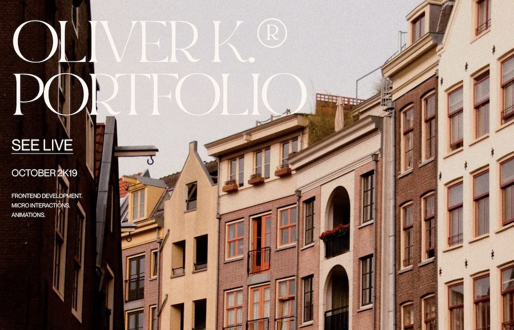
You thought you knew what big text looked like. You did not know – until now. A trend coming our way in 2022 is text on websites so big that we need to lean back in our seats a bit to read it. Check out designer Corentin Bernadou‘s website for a truly “earth-sized” experience. You have to admit, it’s attention-grabbing, to say the least.
4. Neato Button Hover Effects
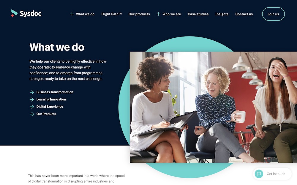
Gone gone gone are the days of a simple glow, outline, or color change upon hovering on a button. Coming soon are more fancy hover effects such as a sweeping color left to right as seen on the Sysdoc website (visit the Sysdoc website and hover over any of the links with arrows next to them to see). For a full list, check out this fun collection of hover effects.
5. Gradients – They’re Making a Comeback!
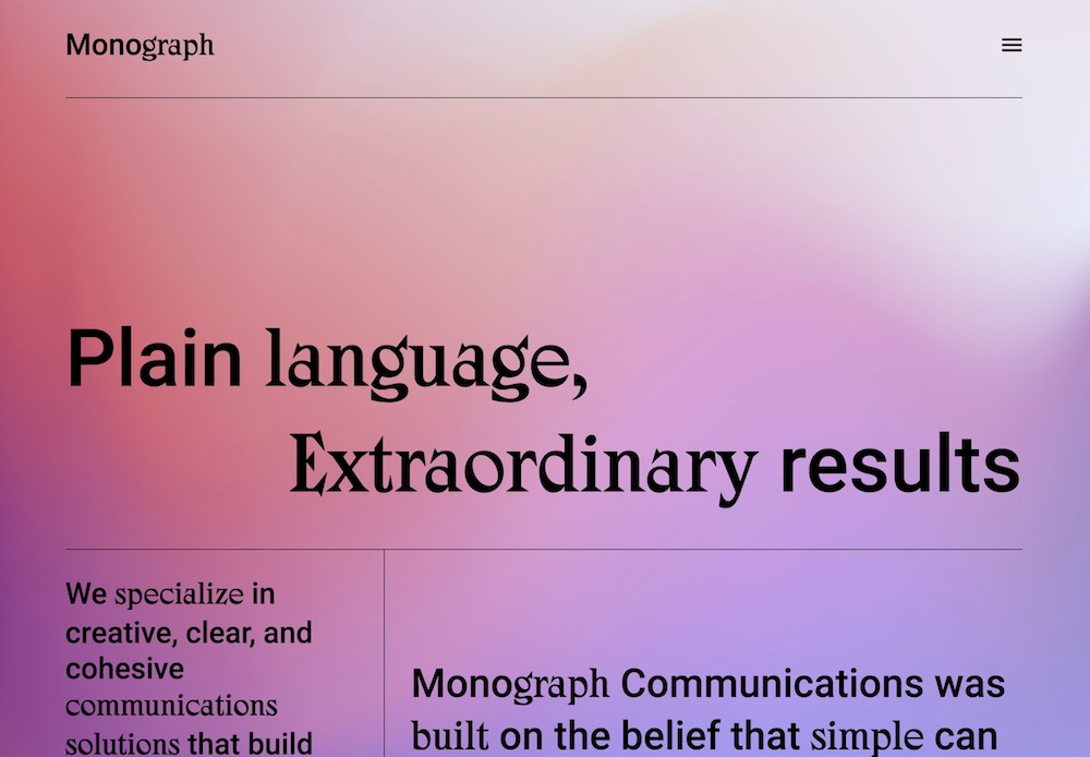
I know, I know, I know. Gradients? Really? Aren’t they a little bit … 2010? Bare with me. These aren’t your mother’s gradients. Check out the creative use of different colored gradient backgrounds on each page on the Monograph website. It’s soothing, modern, and totally refreshing. When done in a creative way, gradients can be positively contemporary.
In Closing…
So there you have it, five web design trends coming up in 2022. Which was your favorite? Might you implement a little new style on your website this year? As always, if you’re looking for assistance, I am here and ready to help.
Happy New Year!

