Are you one of those people to whom “what colors look good together” is a vague and ambiguous mystery that can never be seen as any sort of exact science? I was that way for many years until I finally took to learning something about color theory. This post will aim to take the mystery out of why some color combinations work so well – and why others just don’t. I’ll briefly summarize and demystify three of the most popular color schemes: monochromatic, analogous, and complementary.
Before we delve into our color schemes, let’s briefly touch on the color wheel concept since it’s an integral part of understanding color theory.
You probably remember the traditional red, yellow, and blue color wheel from Kindergarten. However, the color wheel used on computer screens today is the CMYK color wheel: cyan, magenta, yellow, and black (don’t ask me why black is K instead of B – I don’t know). Black is thrown in because if you mix together cyan, magenta, and yellow together, you’ll get a dark grey but never a true black. If you’re curious about why we use the CMYK model today as opposed to the old-fashioned Red-Yellow-Blue model, I’d like to send you over to this nifty and informative Wikipedia article.

Another thing worth mentioning before we get started is what are called tints and shades. It’s like this: you get tints of a color by adding various amounts of white, and you get shades of a color by adding various amounts of black.

Monochromatic Color Schemes
This color scheme is probably the most easily explained: it’s a scheme built on a single base color and any number of either tints or shades of that color. While at first thought, this might seem like a boring ho-hum scheme for a website, the effect can be quite powerful, especially when tints and shades of the base color are paired with black or white. Here are a few examples of successful monochromatic color schemes, the first one using only white and shades of orange, and the second using only white, black, and shades of green.

Analogous Color Schemes
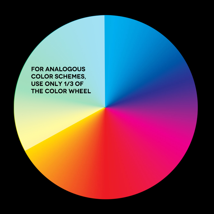
This color scheme consists of colors that are adjacent to each other on the color wheel. A few examples of this would be a green-yellow-peach or a magenta-purple-navy color scheme. It is generally safe to use colors within a third of the color wheel. I’ve created an illustration to show what I mean by this.

Here are a few websites that employ an analogous color scheme quite well. The first uses blues and purples while the second uses greens and blues.

Complementary Color Schemes
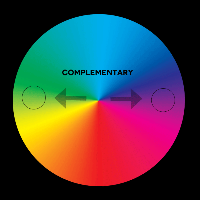
This is probably the scheme most people are already familiar with, on account of the fact that many of us learned about “complementary colors” in kindergarten, along with the red, yellow, and blue color wheel. Complementary colors are those opposite one another on the color wheel. For example: orange and blue, green and pink, or purple and yellow.

Keep in mind that within a complementary color scheme, unlimited tints and shades of the colors you’re using are available. Here are two websites that both use a red and green complementary color scheme, although in very different ways. The first uses tints of red and green, both in pastel tints. The second uses a robust green combined with a deep burgundy.

Choosing colors that fit within one of these color schemes (monochromatic, analogous, or complementary) will greatly increase the odds that your website colors will work well together. A good color scheme can do wonders for a website, the most important of which is framing your site content in a positive, inviting, and engaging environment for your readers.

