As it turns out, Arizona turns my pup Hudson into one dirty dog.
Three weeks into our snowbird stay here, his normally beautiful white coat had turned a not-so-beautiful shade of brown.
But behold, a silver lining! While looking up groomers in our neighborhood, I stumbled across a website I love, which inspired this post (and a new series).
The website belongs to a company called, quite fittingly, The Hairy Dog. Here are five things I love about it (and how you can apply each to your own website). Have fun!

Clear Call-to-Actions
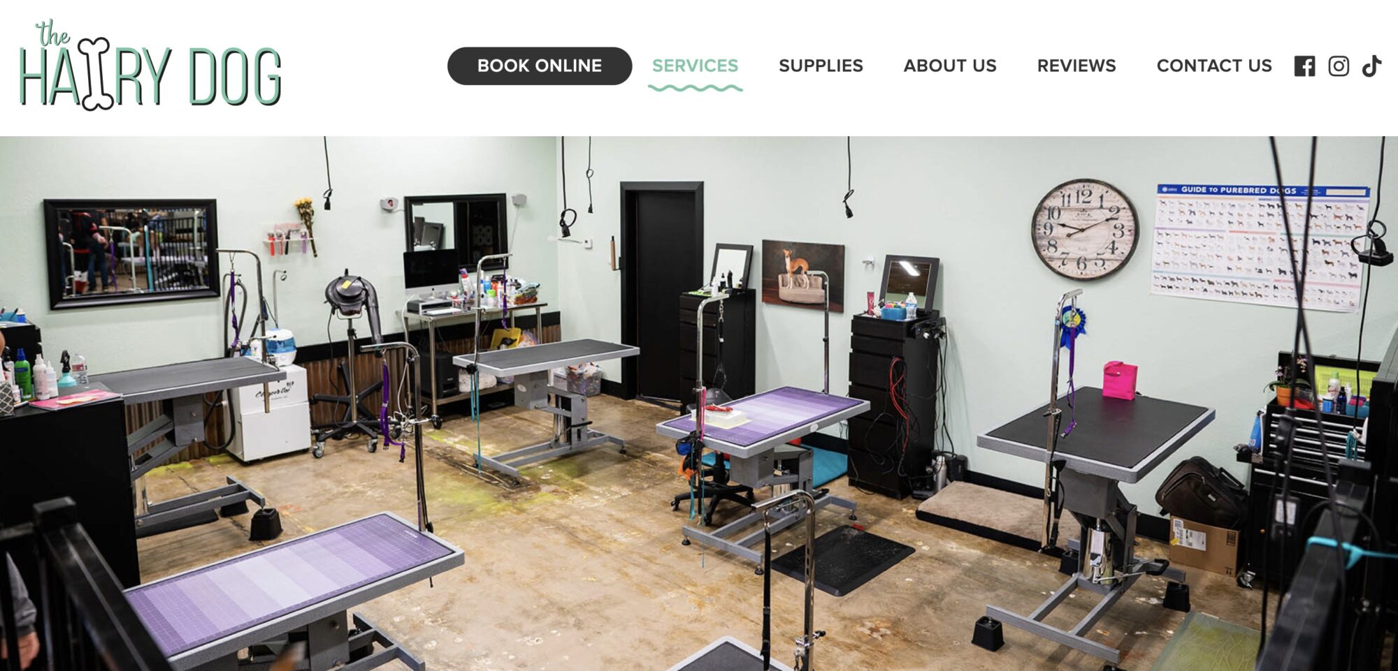
Talk about clear call-to-actions! These really couldn’t BE any clearer. As I’d already gotten a personal recommendation and checked out online reviews, by the time I landed on their website, I was ready to book Hudson’s appointment – and they made it easy as pie. For any visitors looking to book, call, or text, it couldn’t be more obvious (see screenshot above).
Do it on your site: Look over the pages on your website and consider your call-to-actions (i.e., buttons, etc., that encourage your visitor to take that next step). Are they big, noticeable, and crystal clear? If someone lands on your website and only wants to contact you immediately, how easy and obvious is it for them to do that?
Dig deeper (pun intended): Website Homepage Best Practices: The Ultimate Checklist

Authentic Photos on Every Page
At the top of every page on The Hairy Dog website is a beautiful, professional photo that shows the company’s authenticity. For example, on the services page, there is a photo of the room where the grooming happens. What could be more comforting to a fur baby parent than to be able to see exactly where their pet will be?
Do it on your site: Having professional photos taken every five years or so is a highly worthwhile investment in any business. Do yours show how your business is uniquely you? A good brand photographer will not only show up for a shoot but also brainstorm with you about images that will tell the story of your brand.
Dig deeper: Choosing Photos? Avoid These 4 Pitfalls or Walk Away From a Photoshoot Happy

Transparent Pricing
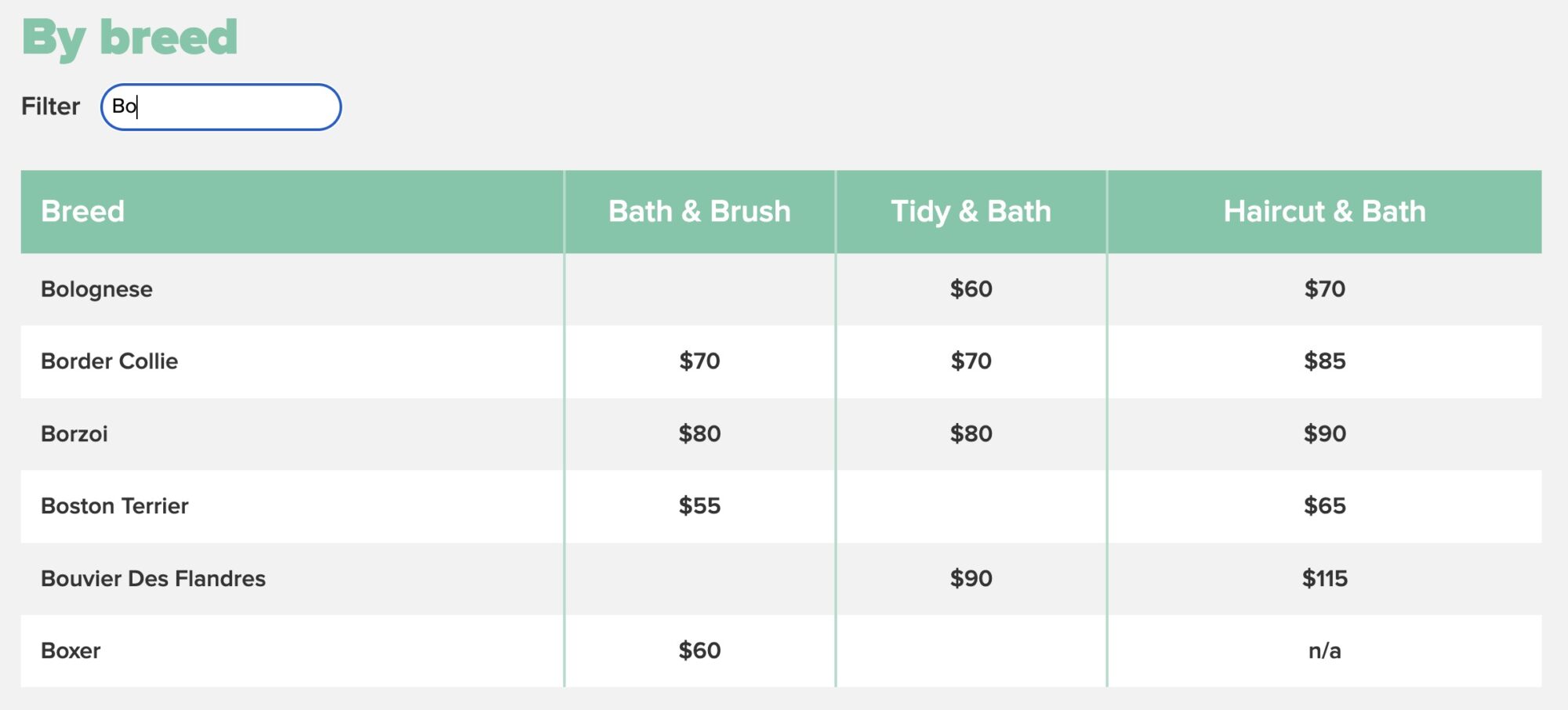
The longer I’ve been in business for myself, the more I’ve come to believe in transparent pricing. I believe it conveys openness and trust, not to mention that it weeds out the people who don’t value you enough to pay you what you deserve. I was delighted to find pricing on The Hairy Dog’s services page – and even better – I loved that I could filter the pricing table by typing my dog’s breed into the search box. Hudson’s breed is the lesser-known Bolognese, which is often not included in online breed lists, so the fact that his breed showed up made me feel seen.
Do it on your site: If you’re not currently listing pricing (even ballpark pricing) on your website, ask yourself why. If you’re worried you’ll scare people off, consider this: Would you rather waste your time having meetings with prospects who are just looking for the cheapest option?
Dig deeper: Before You Set Your Prices, Read This

A Killin’ Contact Page
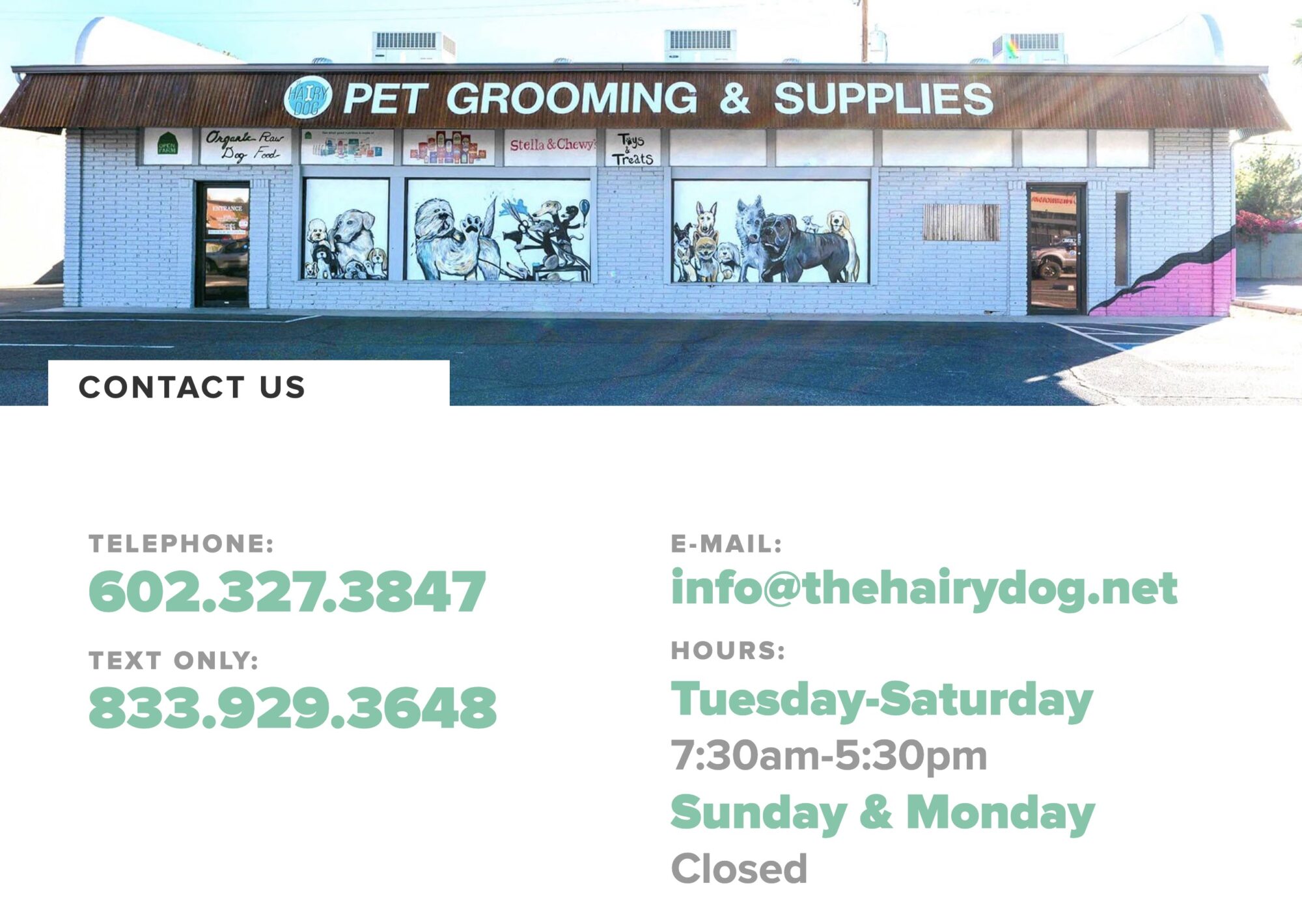
It’s no mystery that your website’s contact page is important. I loved The Hairy Dog’s contact page! It has a big clickable number to call, a big clickable number to text, a big clickable email link, and the shop hours. Additionally, their address is accompanied by not only an embedded Google map but also a big photo of their storefront, so you can’t miss them.
Do it on your site: Are you giving visitors just the information they need on the contact page – no more and no less? If not, in the words of Captain Picard, make it so.
Dig deeper: 5 Best Contact Us Pages & What We Love About Each

Simple Services That Don’t Overwhelm
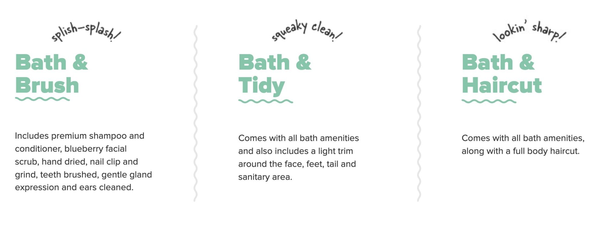
Whereas some groomer company websites have an endless list of services, which can be confusing and overwhelming, The Hairy Dog keeps it simple with just three basic packages to choose from. It took me a matter of moments to decide which one I needed for my dog.
Do it on your site: Did you know that too many options increase the chances that visitors will make no choice at all? Take a look at your offerings. Are they simple and easy to understand, or are there more than you can count? Strive for a minimal approach to get the important info across.
Dig deeper: How to List Services on Your Website: Secrets to Rockin’ It
In Closing
One of the great things about web design is that you can take wisdom every day (which is how often most of us browse websites). If you ever come across a website and think, “Wow, that was handy” or “Wow, that was impressive,” ask yourself how you can apply the principles to your own website!


Pingback: Websites I LOVE Series: Goood Friends - Ellanyze 2024