What is a landing page, exactly?
A landing page is a standalone page on your website created for a singular purpose, typically to get your visitor to purchase a specific product, program, or membership.
Landing pages get their name because they are where a visitor “lands” after they click on a link in an email, social media post, or Google ad introducing them to your new offering.
Unlike typical web pages, which often have many different goals and encourage exploring around your site, landing pages are designed with a SINGLE focus or goal.
When I’m designing a landing page for my website, what should I put on it?
Ah, the ultimate question! That’s exactly what we’re going to talk about: the anatomy of a landing page and the flow of your sections going down the page. Read on to learn precisely what types of content you should put on your landing page.
1) Your Audience’s Problem
You can’t offer your audience a solution before first conveying to them that you understand their problem – and I mean REALLY understand it. How do they feel? Why is it so frustrating? What other problems does it cause in their personal or professional life?
This is a great place to talk in “you” language i.e. Your website looks amateur and you’re tired of it. You’re frustrated with your customers telling you they either can’t access or can’t find something on your website.

2) Things They’ve Tried in the Past
These two first parts of your landing page are basically designed to make your viewer say/think: “Yes! Yes, that’s right! That’s me EXACTLY!” Reiterating what they’ve tried in the past is a powerful way to reinforce that you understand their problem while piquing their frustration and getting them good and ready to hear that amazing solution you can’t wait to offer them.
Again, this is a great place to write in “you” language i.e. You’ve tried DIY website builders in the past, but they’re NEVER as easy to use as you think they’ll be. You took a class to try to learn WordPress and got completely lost. You’ve spoken to web designers but they always talk over your head in tech jargon you can’t understand.

3) Your Solution
Ahhhhhh. It’s that light shining down from the sky, unveiling the cure to everything that ails you. Tell your audience what your solution is, in as concise and simple a way as possible. This is not the place to get into the ins and outs of how it all works. Just tell them the basics of your solution and why it’s so awesome.

4) Your Personal Story (if relevant)
For many of us, we’ve stood exactly where our prospective customers are standing. We’ve felt the pain and frustration that they’re feeling now. If this is the case for you, there’s nothing quite as powerful as your personal story. It conveys that a) you understand their situation, b) there IS a solution for them, and c) you’re the best person to guide them.

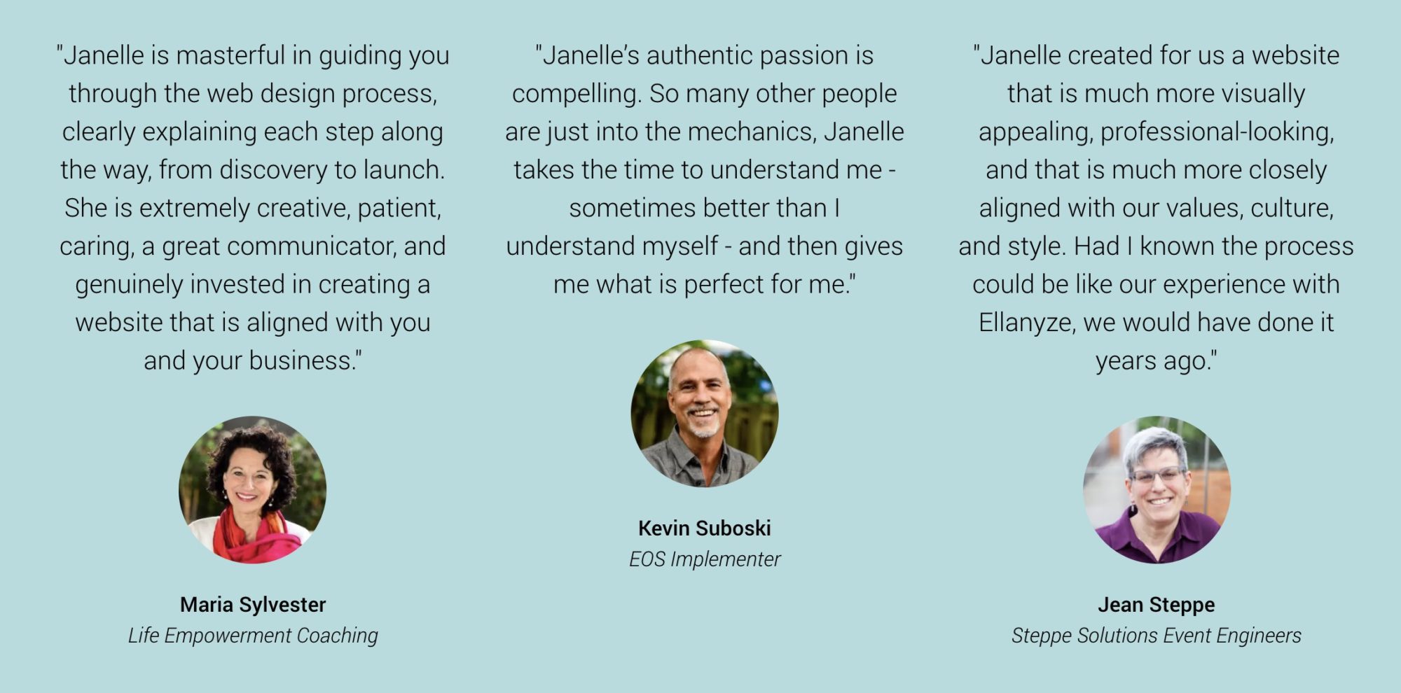
5) Customer Testimonials
When it comes to customer testimonials on your landing page, the more the merrier. HOT TIP: Choose testimonials that highlight what was particularly easy or helpful about your offering and especially that show where they are NOW – the transformation that they were able to undergo with your guidance.
*Screenshot taken from the Ellanyze homepage

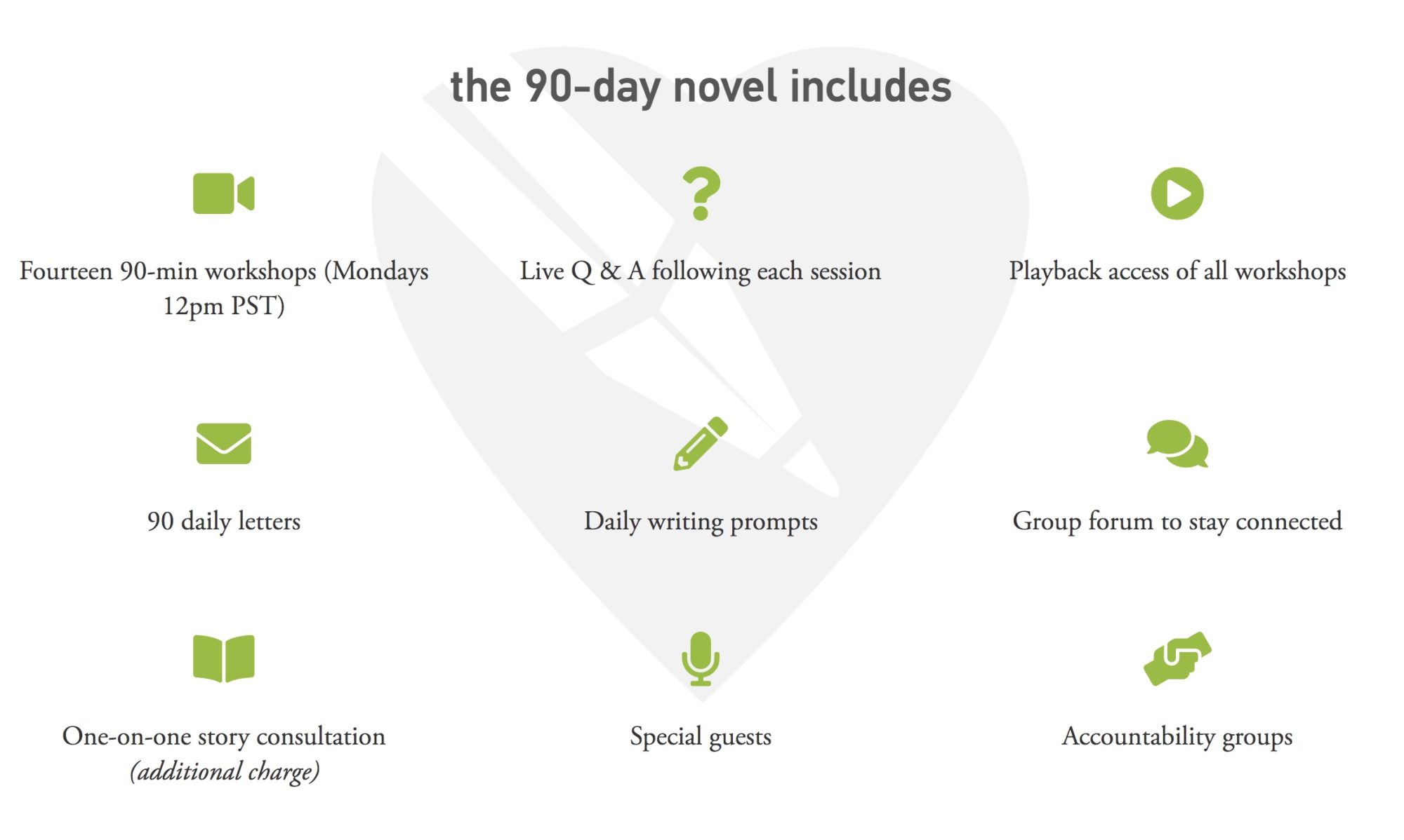
6) What’s Included
Call them includes, call them features, call them components, call them whatever you like – here is where we’ll deliver the details about what exactly a person gets when they purchase or sign-up. HOT TIP: This is a great place to use ICONS, i.e. a phone icon for a monthly call or a book icon for printable materials (see screenshot). Flaticon is my favorite website for free icons.
*Screenshot taken from L.A. Writers’ Lab The 90-Day Novel

7) Statistics
How many people have you helped so far? How many years of experience do you have? How many videos/PDFs/etc. are included in your program? Statistics are impressive, plain and simple.
*Screenshot taken from Alexa Tarantino Website Teaching Page

8) Your Mission
Why are you doing this? As we’re getting to the end of the landing page experience, we want to drive home the point of it all i.e. I want you to know what it feels like to have a website that truly aligns with you and your business, and attracts the people you are meant to serve.
 9) Just Imagine…
Remember how at the top of this landing page we painted a picture of our visitors’ problem and frustration? Now it’s time to paint a picture of their cure. What will it feel like? What changes will they experience in their life? How will things be different? i.e. Imagine having a website that you can’t WAIT to send to your prospects. Imagine KNOWING that your website is doing all it can for your business. This is where you want to get them totally fired up about how much easier life could be after they work with you.

10) Call to Action
As I like to say, make it big, make it bold, and make it beautiful. Your call to action is what people will click on to take that next step. HOT TIP: You don’t have to have just ONE call to action button on your landing page. You can have multiple call-to-action buttons sprinkled among your content so people will have multiple options to click through as they scroll down your page (these should all go to the SAME place however).

Looking for help?
If you’re ever interested in assistance setting up a compelling landing page for a new offering in your business, please don’t hesitate to reach out and inquire for help. I’d be happy to chat.
For more from Janelle at Ellanyze…
Try these other reads on website tips!
“What Should I Blog About?” 20 Ideas to Get You Started
Website Homepage Ideas: 3 Designs That Will Inspire You
What Pages Should a Website Have? Here’s the Must-Have List.

