Your website’s homepage is … pretty important (shocking, I know).
It’s the cornerstone! The linchpin! The pillar! The anchor of it all!
It’s the heart and soul of your visitor’s entire experience on your website.
So this week, here are three websites that completely NAILED IT with their homepage, and some quick ‘n easy pointers you can take away from each.
Enjoy!

Laura Worthington Fonts
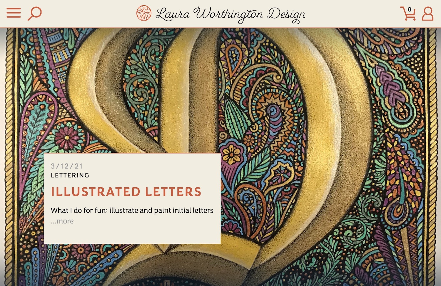
Visiting Laura Worthington’s website homepage is a bit like stepping into a secret labyrinth – one made up of magical fonts, flourishes, colors, and swirls. And as the website’s primary objective is to showcase Laura’s work, this is perfect.
Tips to take with you:
#1 – Make it immersive. How could 100% width background images give your website more of an all-encompassing, immersive feeling for your visitors?
#2 Bring your visuals to life. If your work is highly visual, a parallax or “layered image” scrolling effect can give your website a three-dimensional feeling without being overwhelming.

Stitch Fix
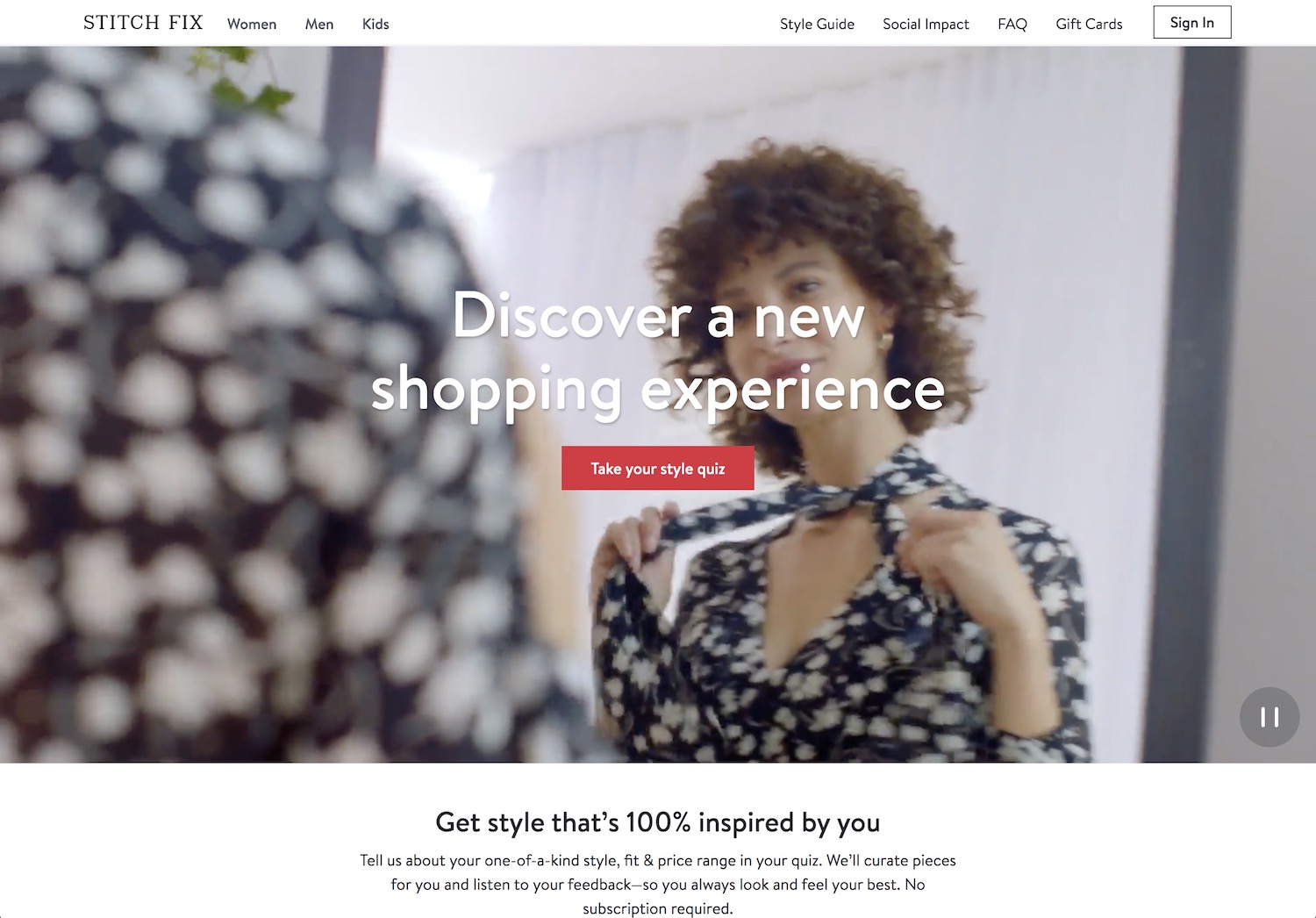
With a brilliant short looping background video, the Stitch Fix homepage is able to convey to the visitor within five seconds that if you sign up, you’ll receive clothes hand-picked for your style shipped to your home. And better yet? There is one, simple call-to-action: a single red button that says “take your style quiz.” Who wouldn’t want to click on that??
Tips to take with you:
#1 – A video is worth a thousand words. Is there a way in which a very short video could convey to your visitor what might take you paragraphs to explain?
#2 Make your call-to-action buttons simple and irresistible. Your homepage call-to-action is where you want your visitor to click first and foremost. So make it obvious (brightly colored), descriptive (no guesswork), and enticing.
Check out the Stitch Fix homepage

Slack
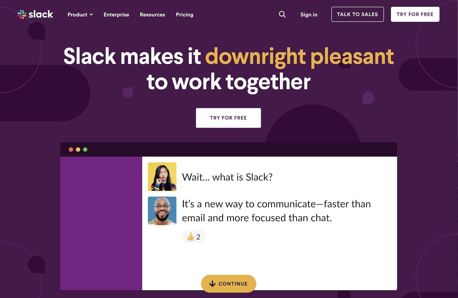
It’s a little-known fact that purple is the very least used color on websites, and Slack rocks it with style. What I love about this homepage is its simplicity. You get why Slack is awesome, you get how it works, and you know where to go next.
Tips to take with you:
#1 – What’s your MAIN benefit? What is ultimately, ultimately, ultimately the gift people get when they work with you? Slack makes their #1 benefit the primary homepage headline, and you could too.
#2 Lead the way. See that yellow button at the bottom of the fold encouraging you to continue? This is what I call leading the way, and it makes your visitor’s experience easy and effortless.
Looking for more website homepage ideas?
Try Siteinspire or Awwwards for more!
Curious about putting any of the above tips to use on your website? Looking for help? I’d love to hear your ideas!
xo
Janelle at Ellanyze

