Do you have a DIY website for your business?
(In other words, did you Do It Yourself?)
If so, that’s OK! And, this post is for you.
Almost every business owner goes DIY when it comes to their first website, and this makes good sense. Typically in these early stages, funds are short (or even nonexistent), and, because new businesses tend to evolve a lot in their first few years, a website invested in too early on might need an overhaul shortly thereafter.
As you can guess, here at Ellanyze I work with many business owners who’ve decided to make the leap from their DIY site to a professionally designed one. As such, when it comes to DIY websites, I’ve seen it all!
Below are the top five design mistakes I tend to see on DIY websites – and how to fix each. If you’ve got a DIY website, pay heed to these tips so your DIY website can look as pro as possible!

DIY Website Mistake #1: Stock photos that clash stylistically
A stock photo is a stock photo is a stock photo, right?
Wrong.
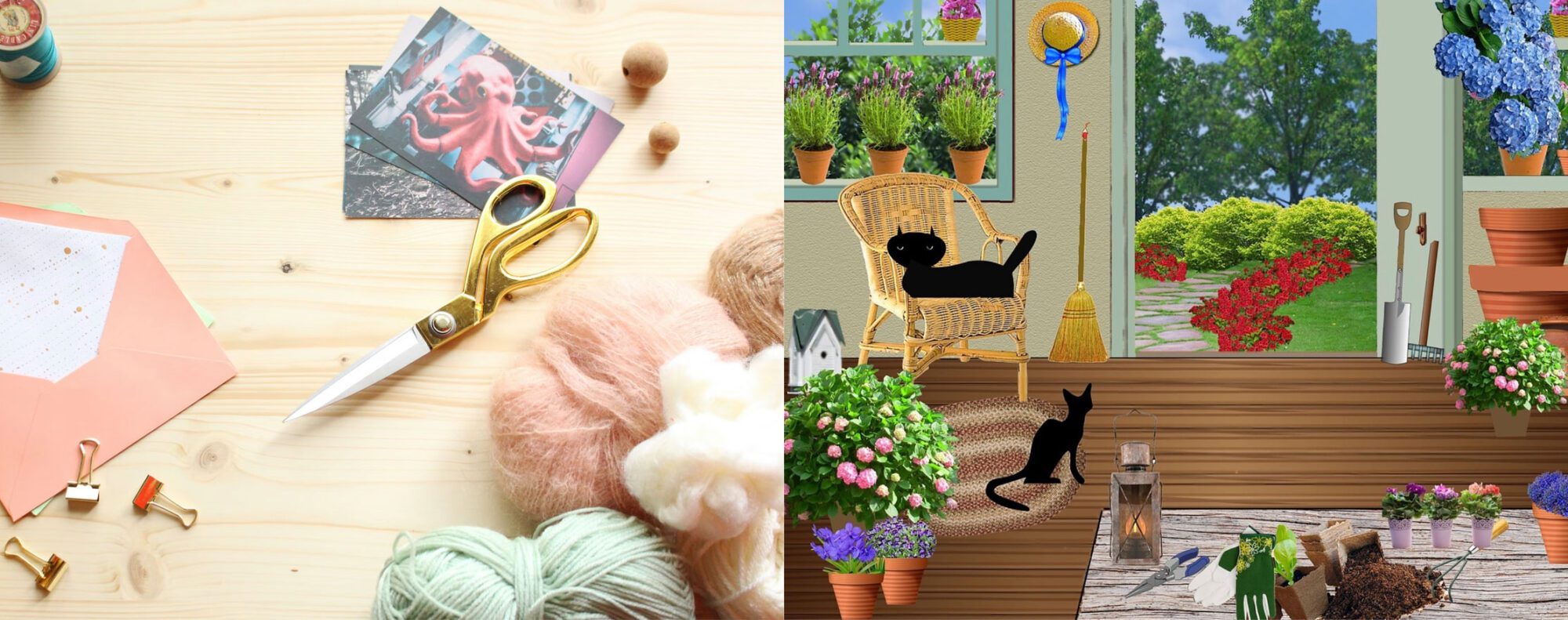
While I definitely think there is a place for stock photos on websites, it’s important to choose stock photos that all “mesh” with one another stylistically so you have a sense of cohesion and unity in your overall design.
Notice how the above two images couldn’t be more different from one another stylistically. One is in a soft-light photographic style, while the other is more of a cartoon-like illustration.
If you’re choosing stock photos for your website, pay careful attention to the “vibe” of each and try to choose photos that all mesh together.

DIY Website Mistake #2: TEXT IN ALL CAPS IS HARD TO READ
Did you know that when humans read, we don’t just read letter to letter – we also use the unique shape of each word to determine what it says? When TEXT IS PUT INTO ALL CAPS, these unique word shapes are lost and turned into a uniform rectangle, making them much more difficult to read.
If you want to use all caps on your website, stick to just the headings (headlines) and avoid using it in paragraphs at all costs. This will ensure that users can read all of your text without issue.

DIY Website Mistake #3: No hierarchy among text and headings
What does hierarchy mean?
“An arrangement or classification of things according to relative importance.” (Google)
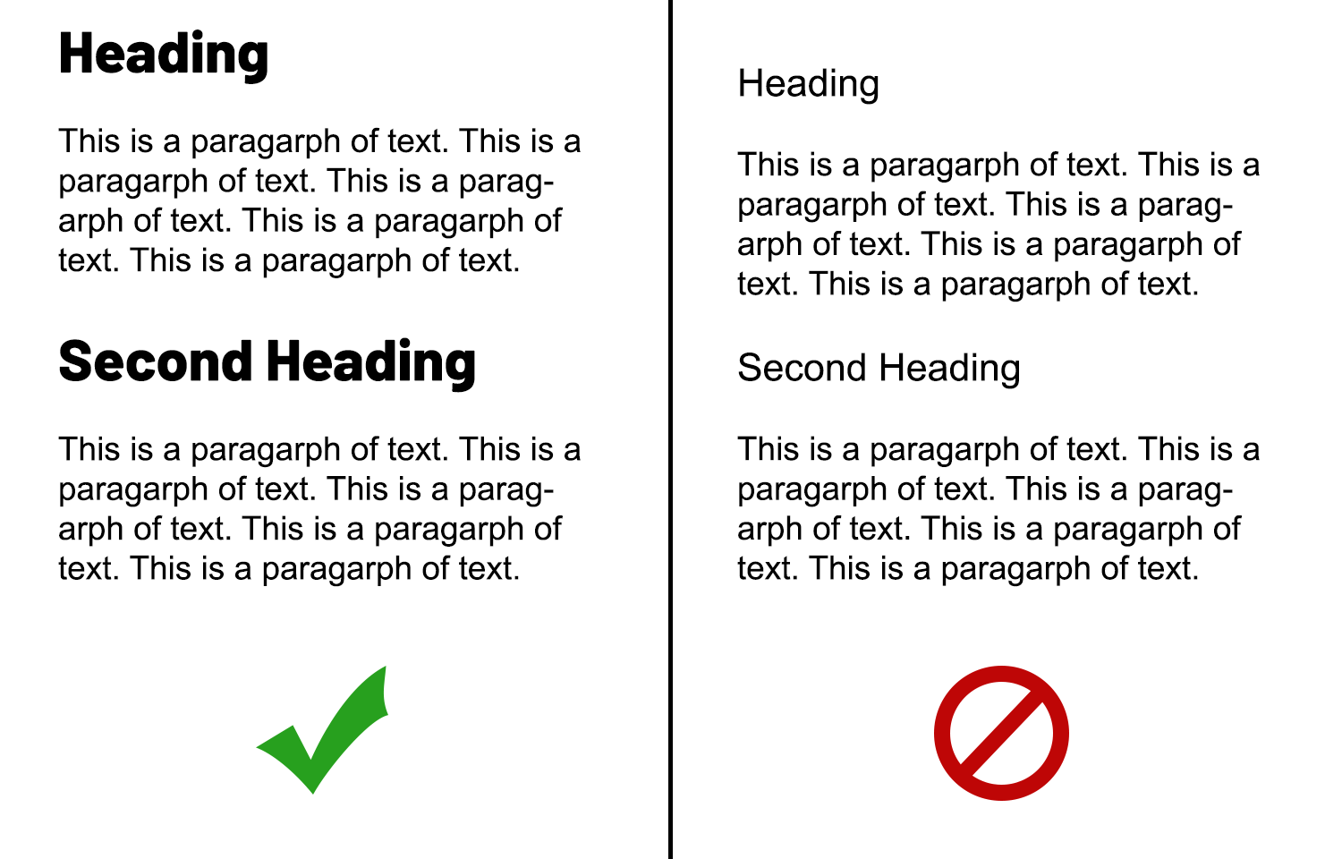
On your website, this means that a text’s size in relation to other text tells the user how important it is. In the example above, notice how the headlines on the left are larger and bolder than the paragraphs. This creates contrast and therefore hierarchy. You know the headings are more important. On the right side, the headings and paragraphs are so similar that it’s hard to tell which is more important.
Here’s how you can achieve good hierarchy among your website text:
- Keep all your paragraph text in the same font size throughout your site.
- Make sure H1 (most important) headings are in a much LARGER font size than your paragraph text.
- Among your headings, make sure each has its own unique font size so that no two are so close in size that they could get confused with one another.

DIY Website Mistake #4: Lack of white space (i.e. clutter!)
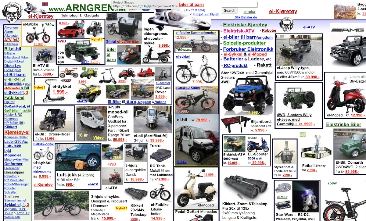
OK, yes, the example above is an extreme one. But hey, it gets the point across. All websites need whitespace – which means, quite literally, space between photos/paragraphs/headings – so that the website can breeeeeeathe. No, it doesn’t have to be white, but it does have to be empty (space). An easy-to-spot sign that a website is a DIY one is that it doesn’t have enough. Give all your elements room to breathe, and your design will thank you.

DIY Website Mistake #5: Not enough contrast between text/background
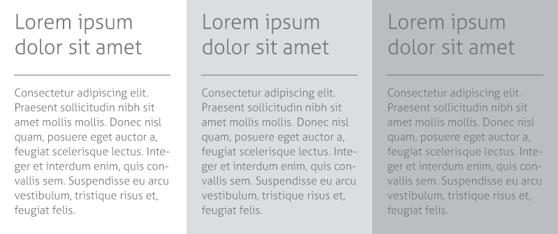
We don’t always need contrast in web design, but one place we really DO need it is between the color of text and the color of what’s behind that text. Take a look at the above example. On the right, there isn’t much contrast between the text/background colors so it’s difficult to read. On the left, there is more contrast so it’s a bit easier to read (although, to be honest, I’d darken that text even more).
A place where DIY websites usually get this wrong is when there is a background photo with text overlaid on it. If you do this, it’s imperative that you either choose a photo with negative space that allows the text to be easily read, or lighten/darken the image and use black/white text so your text has as much contrast with the background as possible!
So how’d you do?
If you made your website yourself, can you improve it in any of the above five ways? Making these seemingly small changes can have a BIG impact on your overall design and user experience.
Looking for more?
For more on improving your business website, check out these other quick reads from Janelle (that’s me) at Ellanyze:
5 Things That Should Be On Your Website Homepage
Movement in Web Design: These 3 Effects Will “Fancify” Your Website

