Have you ever learned how to do something from learning what NOT to do? We all have at some point, and in that same spirit, today I’m going to share with you not websites I love or that you should emulate, but rather websites that are the worst of the worst. Without further ado, here they are, as well as what’s particularly bad about each (so you can make sure and avoid it yourself in the future). Enjoy!
Lings Cars
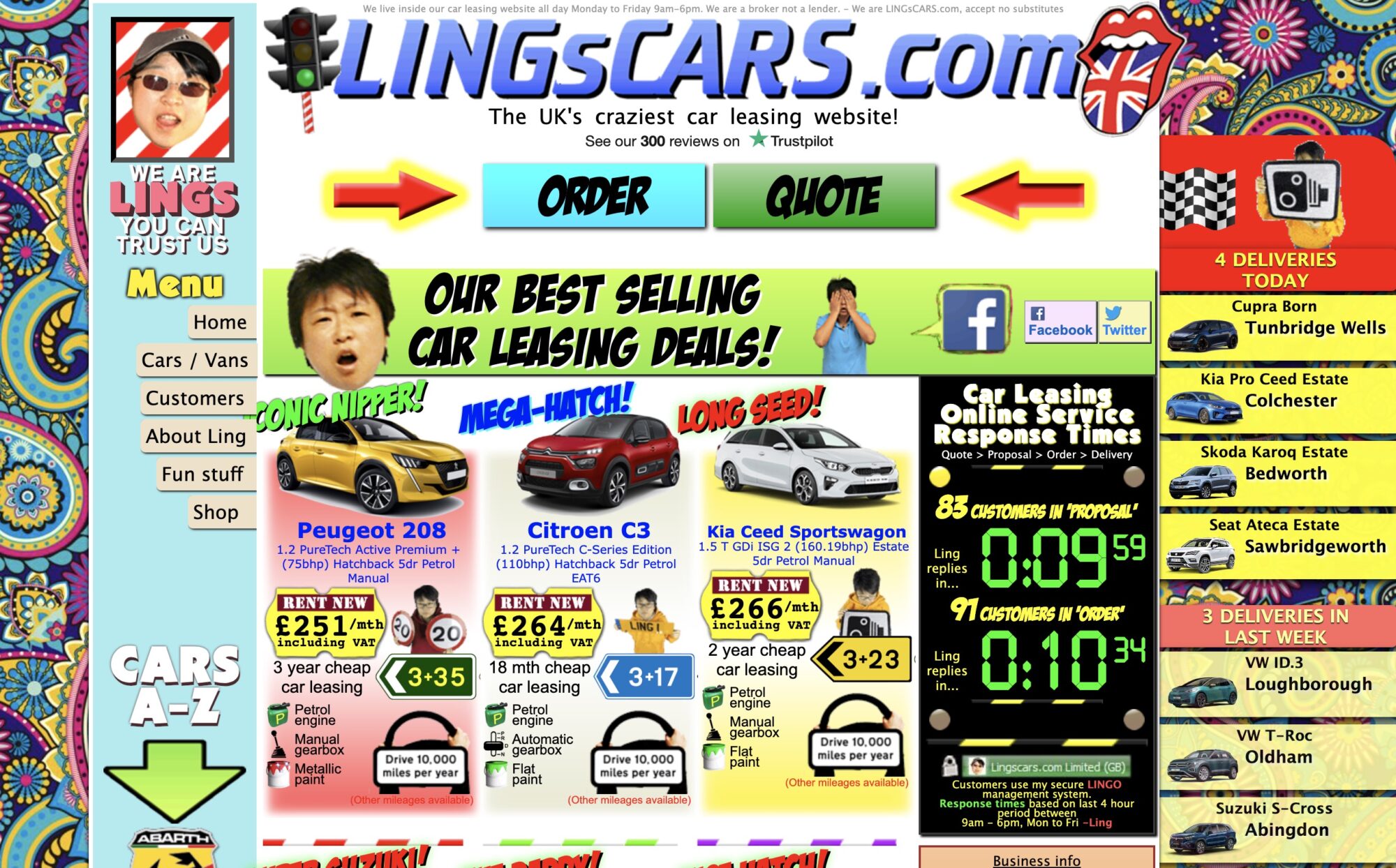
When Lings built his website which he self-proclaims is “the UK’s craziest car leasing website” I’m pretty sure he was going for bad – memorably bad.
What’s so bad about it?
- The color scheme has no rhyme or reason, and would certainly be very difficult to view for anyone with visual impairments.
- The filter search function on the leasing page is complex and difficult to understand.
- In many areas, the text is so small it’s almost impossible to read.
- Although there is a (completely different) mobile version of the website, the desktop version is not responsive, so at some screen widths, you can’t see all the content.
Check out Lings Cars for yourself
Zara
While I’ll confess that I’ve purchased a piece of Zara clothing now and again, I can tell you one thing: I never purchased anything directly from their website. And why? Because it’s bad. Really bad.
What’s so bad about it?
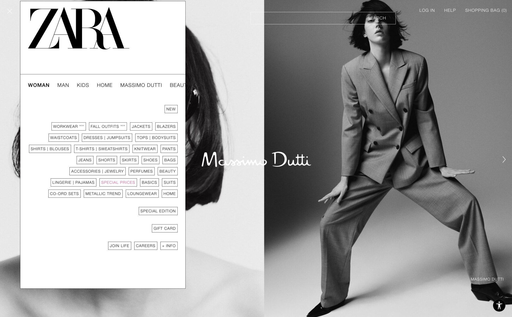
- How do you get to the navigation menu? It took me quite a while to locate it because it’s in the upper left-hand corner (highly unconventional) and consists of an icon of two lines instead of three so it’s hard to see what it is. Never go for unconventionally at the cost of usability.
- The pop-out navigation menu is a jumbled mess. I had a hard time using it.
- Text across the site is small and hard to read. Never go for style at the cost of usability.
Berkshire Hathaway Inc.
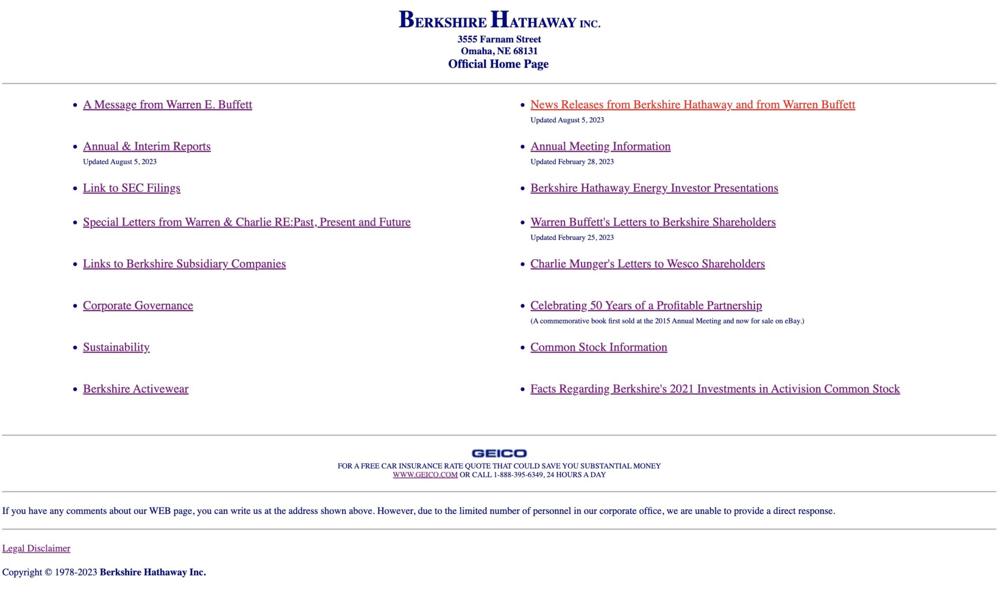
While I realize the above is not their consumer-facing website for purchasing or selling a home, it’s still one of the faces of the company and the first website that comes up in search results for “Berkshire Hathway.” There’s no excuse for it being so bad.
What’s so bad about it?
- The font looks like Times, an old and virtually now unused font that no one needs to use when there are thousands upon thousands of better options available.
- There is zero visual interest on the page (or on the website that I could find). Not a one photo. Not a one.
Check out Berkshire Hathaway Inc. for yourself
NYU
NYU, really? When I landed on the website homepage of one of the country’s most prestigious universities, I expected more. What’s so bad about it?
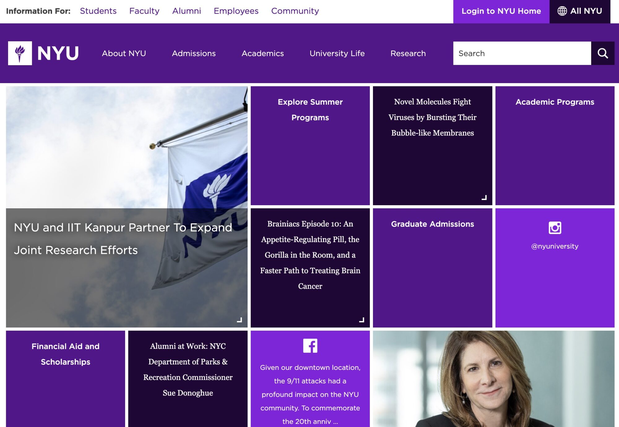
- The series of purple boxes have no visual hierarchy to communicate which is more important than the others, and also nothing visual to communicate what they’re about or where they take the user when clicked besides for very small text that is hard to read.
- There are not one, not two, but THREE different fonts being used in the boxes on the homepage, giving the website an amateur feel.
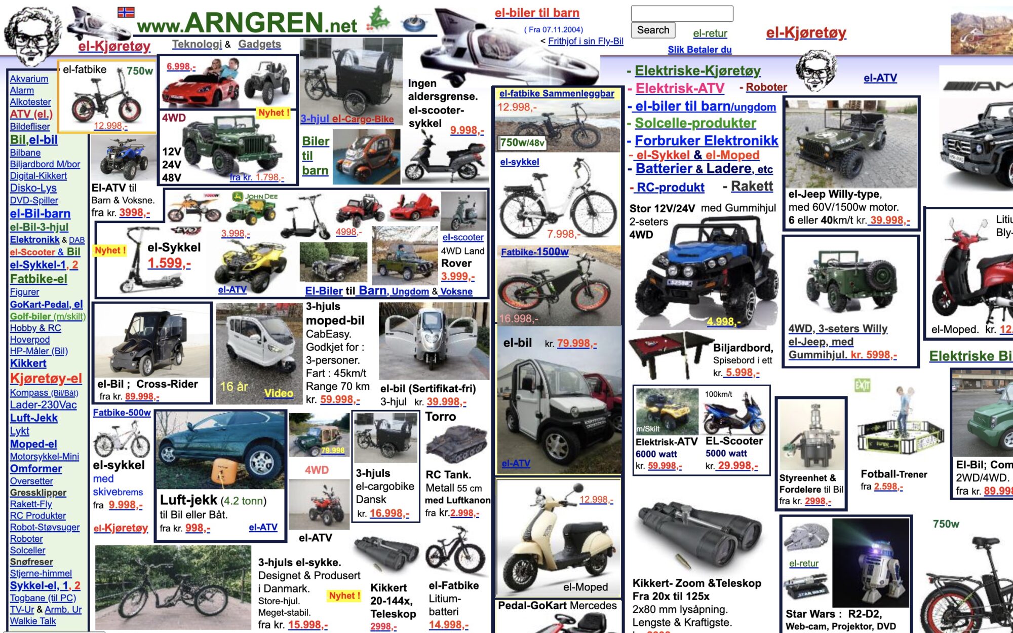
ARNGREN.net
It almost looks as though the maker of Arnsgren.net, a vehicle and outdoors-related product website, was trying to land itself in the world’s top ten worst websites.
What’s so bad about it?
- Clutter clutter clutter. I’m not sure how a user could go about finding what they’re looking for – it would be like searching for your favorite pen in a room that is a complete pigstye.
- On desktop view, the width of the website is far too wide, so a user must scroll horizontally to the right quite a bit to be able to view all the content.
- There are Christmas animations in the footer all year round, communicating to the user that this website is not maintained or up to date.
- The telephone numbers in the sidebar are not clickable for the user to call.
Check out ARNGREN.net for yourself
In Summary
What have we learned from these five laughable bad websites? A lot of things! Here’s a quick summary of 10 things we learned about what to strive for on your website to NOT be like these five companies above.
- Employ a color scheme that is unified, aligns with your brand, and is not visually overwhelming.
- Ensure that all text is large enough to be read by users of all ages and abilities.
- Ensure your website is responsive at all screen widths, creating a good experience for users on all devices.
- Don’t stray from website norms that are so standard that users expect them, such as a link to the menu being in the upper right-hand corner.
- Choose fonts that align with your brand, are easy to read, and also have some style! Choose one or two, but never more than three (and have a good reason for using a third).
- Use carefully chosen high-quality images that reinforce your message, help the user understand where they can click to find what they’re looking for, and add visual interest to your pages.
- Whitespace is a good thing! Use it to give your pages room to breathe.
- Make sure any listed telephone numbers are clickable so that users on their phones can call you with one click.
- If you employ seasonal elements on your websites (i.e. a holiday theme) make sure they are taken down promptly so your website stays relevant and up-to-date.
- Employ visual hierarchy on your pages so users can understand what the most important element on the page is, what’s second most important, etc.
Looking for more?
Here are some other past posts I’ve written on website improvements that you might enjoy:
5 Common DIY Website Mistakes (& How to Fix Them)

