
While admittedly fishing is not my thing, awesome websites are. And when I (strangely) stumbled across the Outcast Landing & Moby Dick’s Private Pond Fishing website, I knew it was time for another installment of my Websites I LOVE Series! Read on to learn why their website rocks and what you can take away to improve your own.
A Vibe!
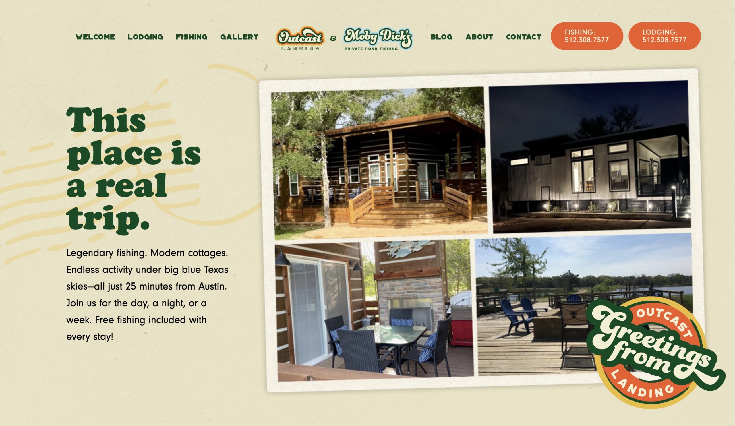
What do I mean by a “vibe”? I mean from the moment you virtually step onto this website’s homepage, you can immediately tell some important things about this business simply from its overall aesthetic, such as:
- They’re friendly and approachable! That’s why they use puns throughout the site such as “drop us a line” on their contact page 😅
- The postal/postcard aesthetics tell you it’s a getaway type of place
- The photos are displayed with white edges, making them look like old-school Polaroids
- The colors and fonts are undeniably fun and make you want to scroll down to see what comes next
Do it on your website: Your business is unique, and as such, your website should have its own unique vibe. This could be a strong, powerful vibe, a retro vibe (i.e. above), a whimsical and child-like vibe, or anything else. If the fonts, colors, aesthetics, headlines, and copy don’t reflect a unified vibe on your site, it might be worth talking to a web designer or branding professional.
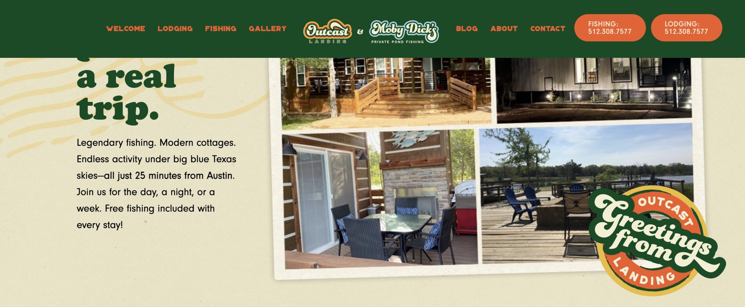
Sticky Header / Navigation
On any page of the Outcast Landing website, as soon as you scroll down, you’ll see the header background turn green as it sticks in place. What’s so cool about this? It means that wherever you are on any page, you can immediately get to another page or more importantly click one of the call buttons to get in touch.
Do it on your website: Setting up a sticky header looks a little bit different depending on which WordPress theme you are using. If you’re feeling adventurous, you can take a stab at it using the Sticky Menu & Sticky Header plugin, or reach out to a pro for assistance.
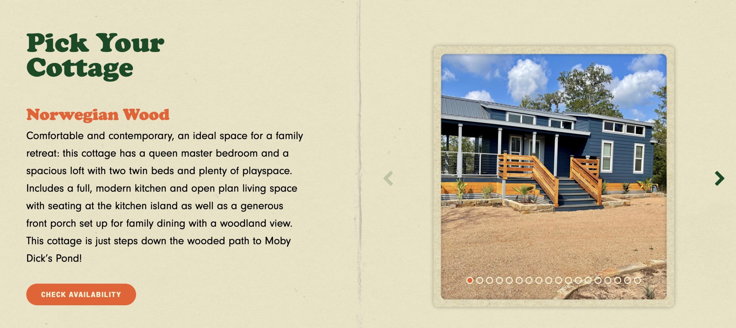
Browse with No Clicks
One of my favorite parts of the Outcast Landing website is its Cottages page. Why? As you scroll down this page, you can browse photos of each cottage (via the left/right arrows) all without leaving this page. Fewer page clicks = a better user experience!
Do it on your website: Are there parts of your website where you could allow the user to explore different options or areas without having to leave the page? Navigable photo galleries are a perfect example of this. Toggle open/close accordions would be another. Get creative and see if you can allow your users to see and/or find what they’re looking for in as few clicks as possible.
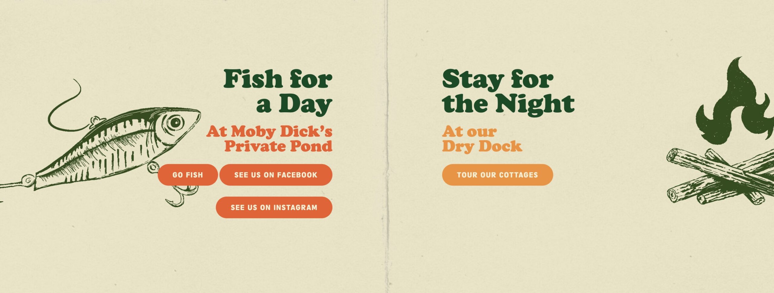
Keep it Simple
A section on the homepage I love is pictured above – it communicates in roughly ten words or less what a person’s options are: fish for a day, or stay in one of their cottages overnight. Simple!
Do it on your website: Taking a look around your own website, are there places where you might be making things more complicated than they need to be? One of the trickest and most important things to accomplish on a website is giving the visitor just as much information as they need at any given time – no more and no less.
In Closing
What makes a dynamite website is a whole collection of things – from aesthetic to simplicity to usability and more. Above I’ve listed some of these components for the Outcast Landing webiste If you think any of these features would help give your website a boost, please do feel free to get in touch! Let’s talk 🙂

Pingback: Websites I LOVE Series: Goood Friends - Ellanyze 2024