In my previous blog post, Recipe For a Rebrand, I allude to a question I’ve returned to again and again in my business over the years:
Is it me and do I love it? 🤔
A trusted compass in my business and life, this question has never led me astray. And so it was that after 6+ years with the same website (and, in fact, the website that kickstarted my reinvented brand of Ellanyze), I took a look at it one day and asked myself this question. Realizing the answer was no and no, I knew it was time for a change once again.
Lo and behold! The new Ellanyze website!
And because the spirit of my blog is in GIVING to you, dear readers, I’m not going to simply show you my shiny new site (although that would be fun). Rather, I’m going to tell you my favorite parts and for each explain how you can implement them on your own website. Everybody wins 🥳
Ready? Let’s go!
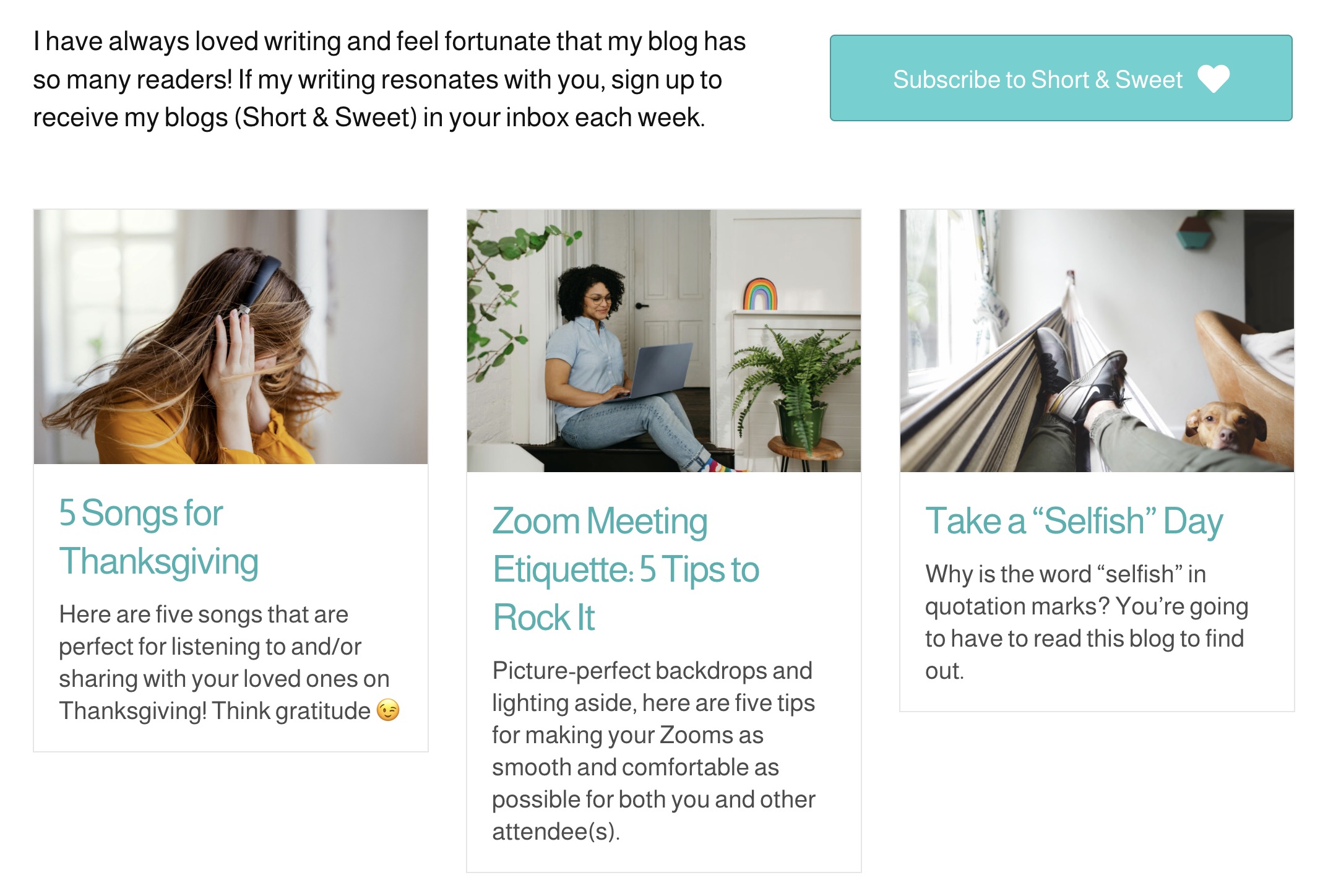
Prioritizing Mailing List (Short & Sweet) Sign-ups
If there’s one thing I’ve learned over 15 years of blogging, it’s that writing great content and growing your reader base are two VERY different things (in other words you can do the first amazingly and not have any of the latter). Thus, on my new website, I decided to make my Short & Sweet (weekly blog) sign-up a real priority. What does this mean? It’s on the homepage. It’s in the footer on every page. It’s at the top of the blog page (see above). It’s in the sidebar on every individual blog. In other words, you can’t visit my website without having the option to sign up. WIN!
Do it on your website: What’s a priority for you in your business? Mailing list sign-ups? Or something else? Whatever you decide is a priority, make it visible in more places than one so you make sure it gets seen.
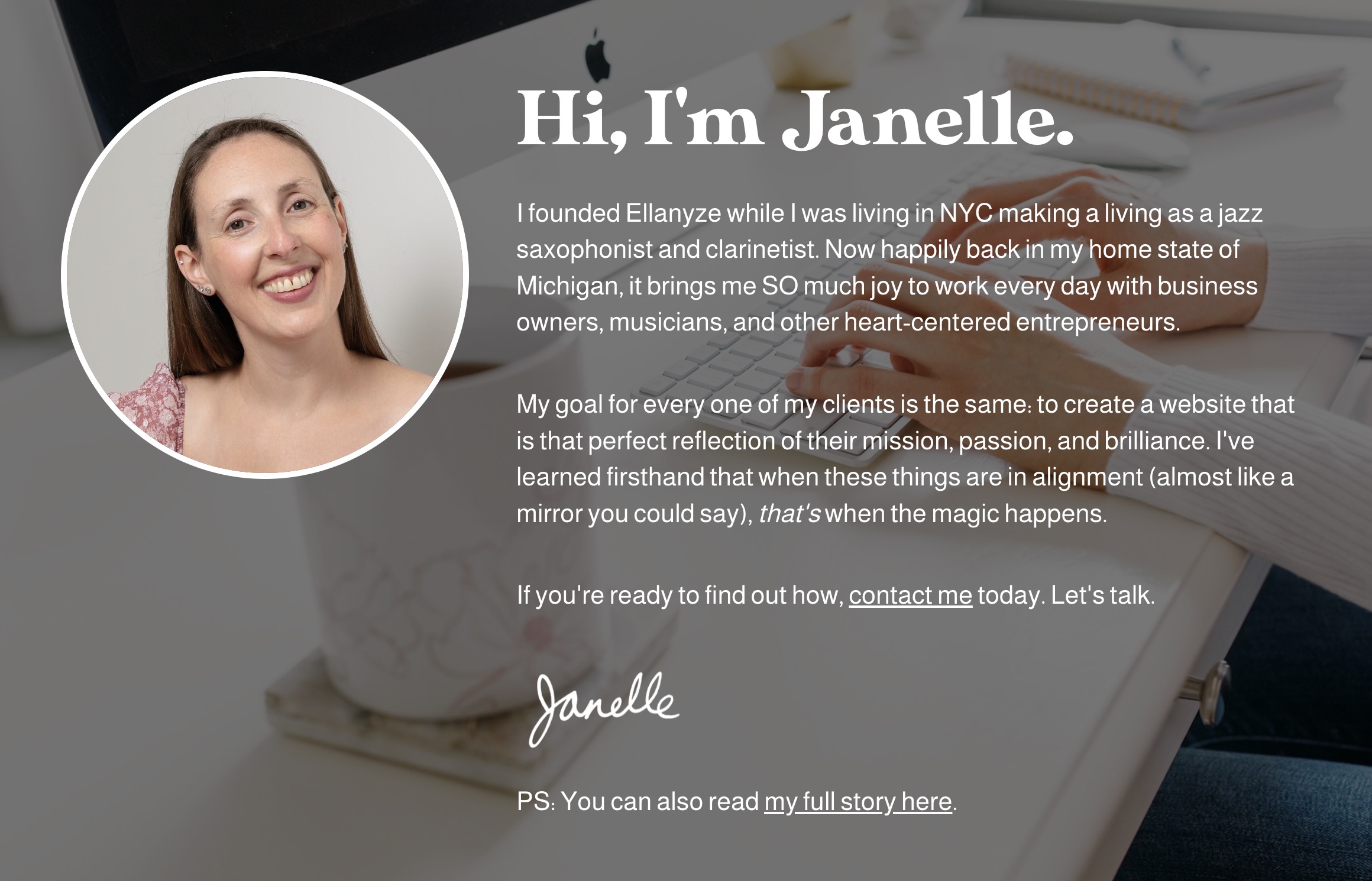
Authenticity and Warmth with a “Hello” From Me On the Homepage
I tell my clients all the time: Your audience wants to know you. This is exactly why I decided to put a warm welcome from me right on my new website’s homepage (and not at the bottom of the page). It’s concise and to the point – just sharing a touch of my story with an invitation to learn more. I hope that this will personalize and humanize my company and website a lot sooner for visitors.
Do it on your website: Are “you” the business as I am in mine? If so, say hello to your visitors from the heart right on your homepage. It will engage and delight new and old visitors alike.
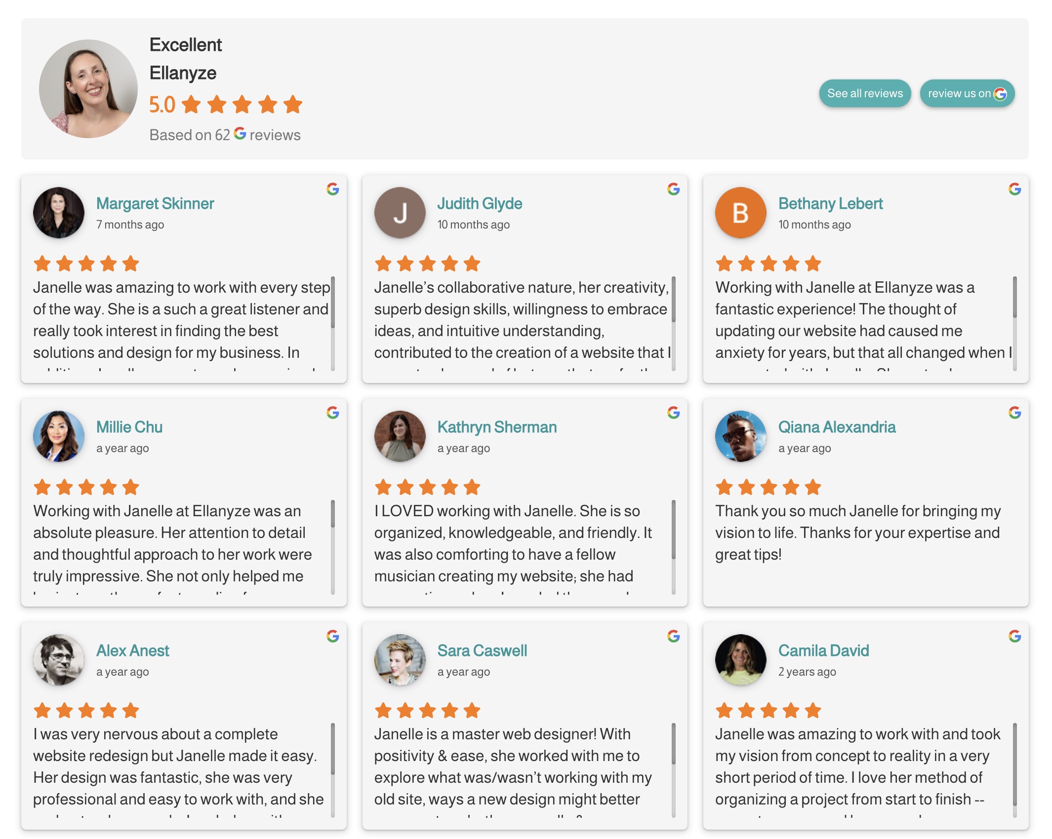
A Super Sweet Google Reviews Plugin
What’s even better than testimonials on your website? Testimonials with photos. What’s even better than testimonials with photos on your website? Testimonials that are dynamically brought in straight from Google so your visitors know they’re legit.
Do it on your website: Enter the Business Reviews Bundle plugin by Rich Plugins. Simply connect your Google Business account and in come your reviews. The best part? You’ll no longer have to update your reviews on your site – they’ll update automatically.
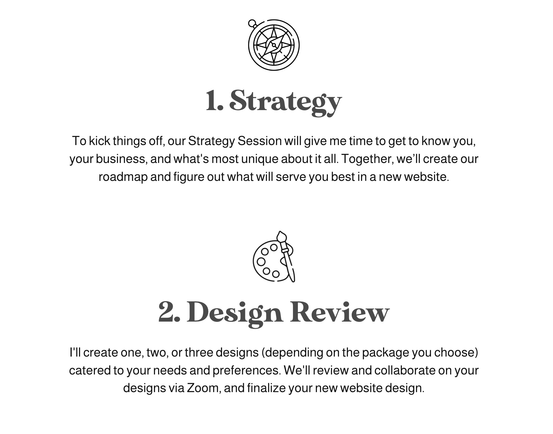
A Process Page Readable in 2 Minutes
I’m a big believer in the importance of having your process on your website. I believe it takes the mystery out of things for your prospective customers and puts their minds at ease, for they now know what’s going to happen next. That being said, it needs to be short enough so people can read it quickly and move on. I’m proud of my new My Process page which consists of six steps and just a sentence or two per step.
Do it on your website: Is your process on your website? If not, perhaps it should be. Hint: if you don’t have a rock-steady, super well-outlined process to begin with, now is your chance! To me, it means the difference between the novice and the pro.
New Fonts: Fun & Functional
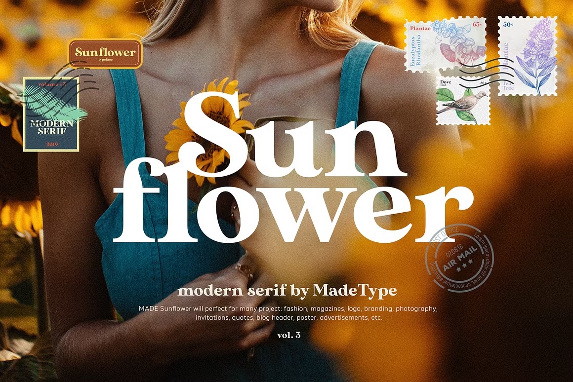
I knew I wanted to update my fonts on the new website and my primary concern? Readability. As an avid blogger, it’s extremely important to me that all fonts on my website are easy on the eyes for readers of all kinds. Therefore, I went with a fun retro-style font called Sunflower for my headings (see above) and a simple sans-serif for the body copy (what you’re reading now). What do you think? Did I meet my goal?
Do it on your website: Updating your fonts can be a great way to refresh your brand and marketing materials without a full-on rebrand. I like DaFont for browsing fonts. Just remember to always check if your fonts are free for professional use and if not, purchase a license.
In Closing
Redesigning your business’s website is a big task, no doubt. But every 5 years or so, it simply must be done if you want to stay current and modern, and make sure your website keeps up with your ever-evolving business!

