Lowertown Bar & Cafe is a relatively new spot in Ann Arbor, but what sets it apart is not its novelty but rather its location. Situated on Ann Arbor’s north side, it is undeniably off the beaten path from where most of our city’s cafes and bars are. Because I grew up just a few blocks from its location, I was particularly intrigued when I noticed it driving by the other day.
And, of course, being the web designer I am, what was the first thing I did? Checked out the website, of course.
To my surprise and delight, I LOVED it! And so it is that Lowertown Bar & Cafe is the latest in my Websites I LOVE Series. Without further adieu, here are five reasons this website rocks along with ideas you can apply to your website.
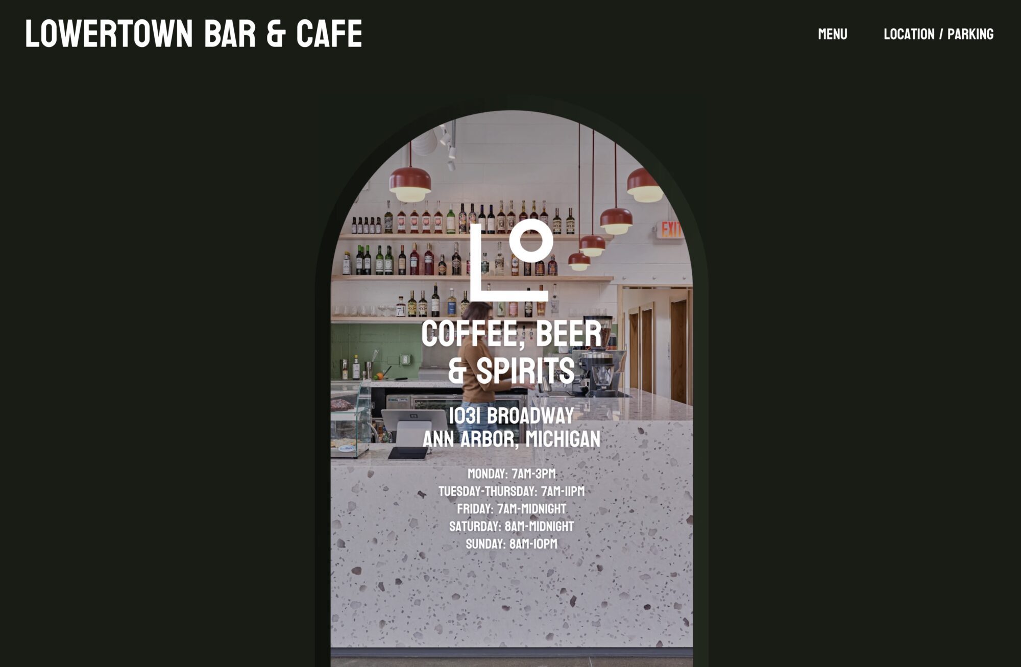
A Doorway That Draws You In
Upon initial page load, the website design draws you in by showing you a photo of the cafe through what appears to be an arched doorway (see image above). Better yet, as you scroll down, this doorway slowly expands, mimicking the experience that you are walking inside. As a web designer who firmly believes in creating websites that mirror In Real Life experiences, I loved this.
Do it on your site: Is there an image or photograph that would be particularly “inviting” to your website visitors? Give some thought to what type of imagery would mirror the In Real Life experience they would or will have in using your services.
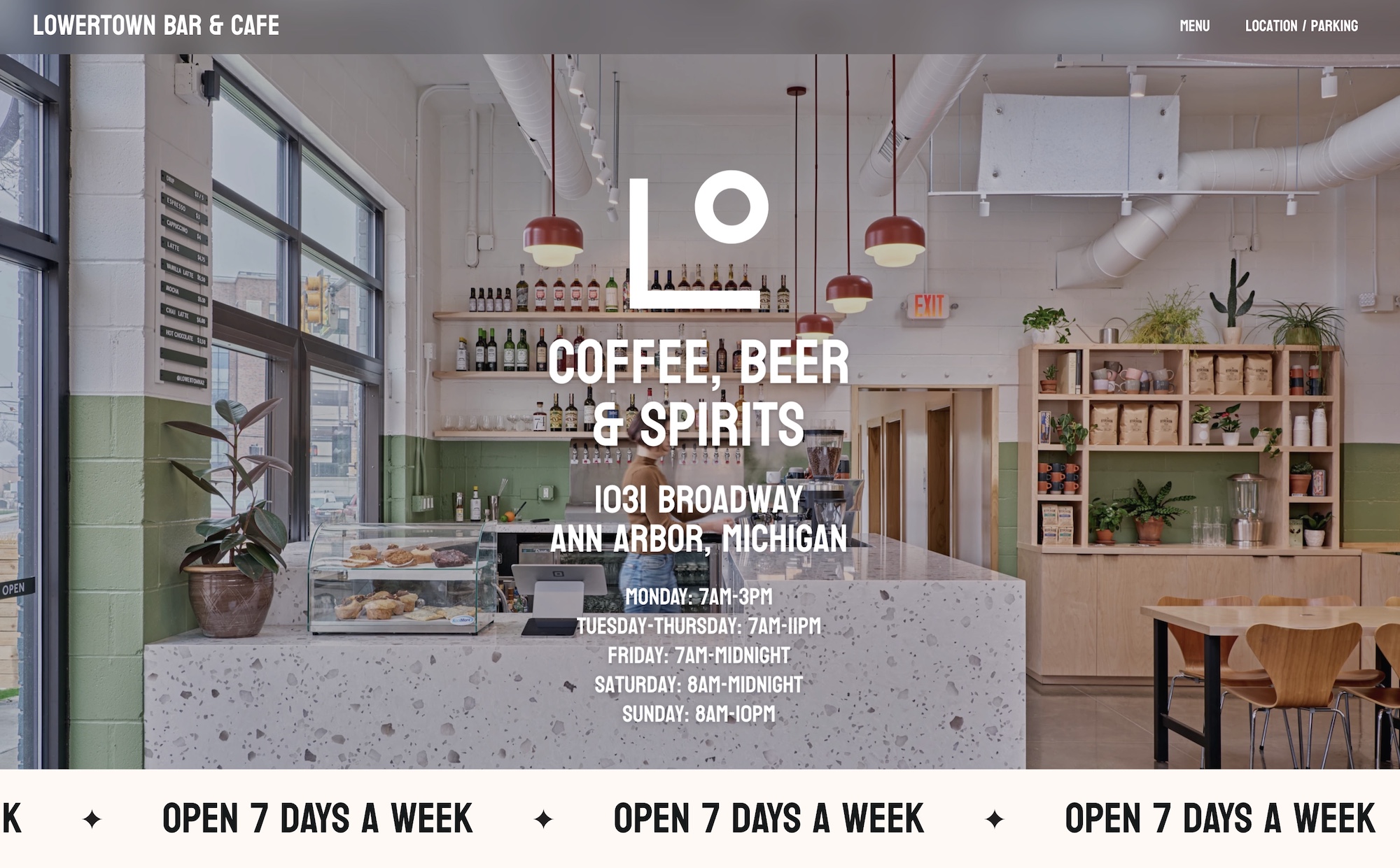
A Ticker With Important Info
A running ticker (i.e. a string of text that runs horizontally across the screen), while not as common as it was back in the early days of websites, is making a comeback – and this website makes great use of it. As you scroll down after you’ve “entered” the doorway into the cafe, the very next thing you see is a ticker of text running across the screen, reading OPEN 7 DAYS A WEEK over and over again. It gets the point across. After visiting this website, there is no doubt about it – you WILL know that they’re open every day.
Do it on your site: What is something important that you want to make sure every single visitor leaves your website knowing? Try a running ticker to get your point across (and contact me if you need assistance!).
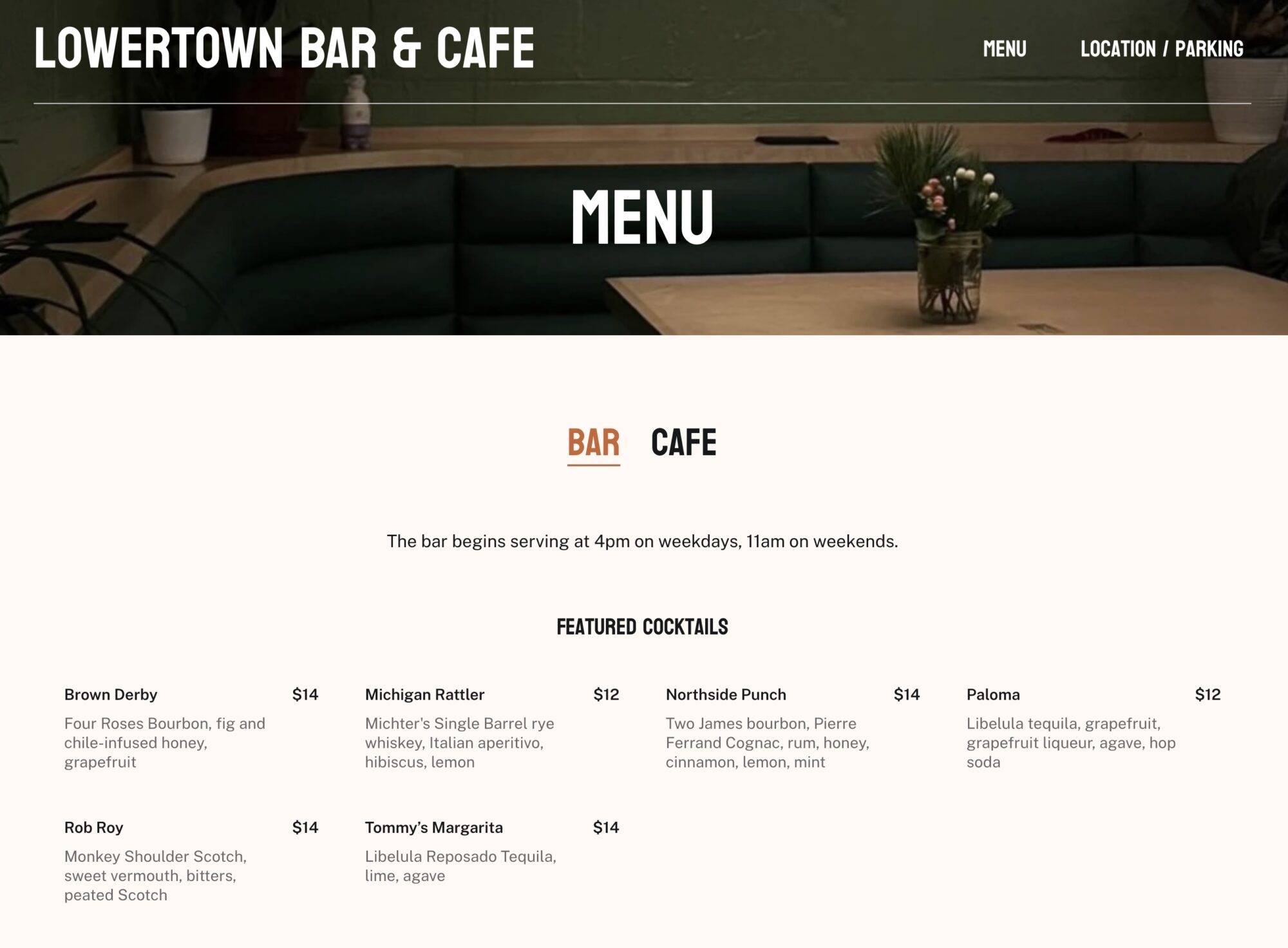
A “Toggle Between” Menu
Lowertown is both a bar AND a cafe, and its menu page handles that fact perfectly by allowing users to quickly toggle back and forth between the Bar and Cafe tabs at the top of the page. Most visitors will already know whether they’re interested in bringing their laptop and sipping coffee beverages during the day or coming for mock/cocktails with friends at night. The toggle feature allows all users to quickly get to what they’re looking for.
Do it on your site: Is there a page or section of your website where users will fall into one of two categories? A toggle feature such as the one above can be a great way to allow all users to quickly get where they need to go.
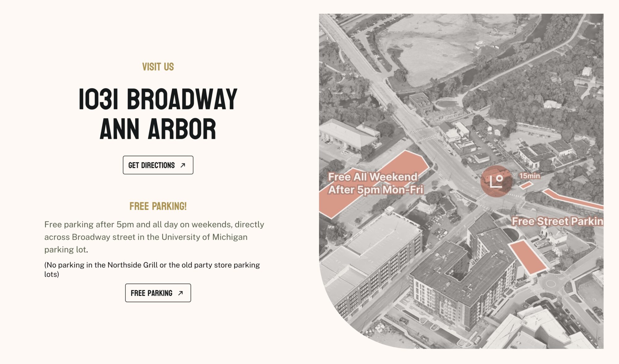
Give The People What They Need
Hands down, the single biggest challenge for this new cafe and bar is its parking situation. Not in a location with lots of street parking available, the owners knew this and got ahead of the curve by addressing it outright on their website. They provide an aerial image of the area showing exactly where parking is available, as well as a text explanation to accompany it.
Do it on your site: Do your customers routinely experience confusion or frustration around any aspect of using your business or services? Your website is the perfect place to address this confusion. And the best part? You can experiment with different methods until you find what works for your customers.
A Footer That Has It All
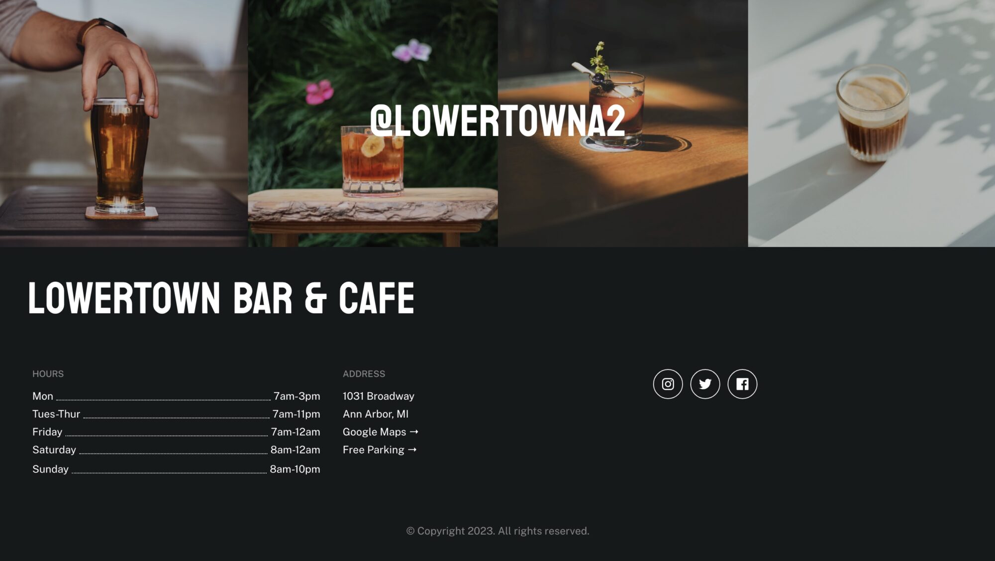
Rather than dynamically bringing in the latest Instagram posts to the page, this website features four curated and carefully placed photos with their Instagram handle on top in large font. They’re prioritizing their Instagram presence over other social media platforms in this way, and it’s without question highly effective. What else is in the footer? Their logo and name for reinforced brand recognition, hours, address, and yet another link to see where you can park for free. In short, it gives visitors everything they might need.
Do it on your site: What do you have in your website footer? If you’re a brick-and-mortar, hours of operation along with your address and phone number are a must. And if you’re an online/virtual business? It’s up to you to get in the minds of your customers and anticipate what pertinent info they might be looking for.
In Closing
It’s always great to support local businesses in your town – especially if they have a dynamite website like Lowertown Bar & Cafe does 🙂 If you’re interested in implementing any of the ideas or features mentioned above on your business website, feel free to get in touch. Let’s chat!

