
Never underestimate the power of type. You may not realize it, but each time you observe an ad on the bus, read a flyer posted at your local coffee joint, or flip through the pages of your favorite magazine – the fonts used there are affecting the way in which you perceive the information.
And the web is no exception to this rule.
Fonts have an enormous effect on the feeling your website gives its visitors. A good font choice will make a website’s design really pop as well as enforce its overall message. Conversely, a bad font choice can drastically diminish the effectiveness of your website. This blog post will aim to educate readers about the basics of font usage by presenting a) the four main font categories, b) a set of questions to ask yourself when choosing fonts, c) DOs and DON’Ts for general font usage, and d) a handful of great websites for free fonts and other resources.
Enjoy!
Font Categories
Depending on whom you talk to about this topic, you might be told that there are anywhere from four to fifteen categories that fonts fall into. For simplicity’s sake and in the interest of time, I will cover only the four main font categories. I feel much can be gained from familiarizing yourself with these four categories alone. The four categories are serif, sans-serif, script, and decorative.

Serif
– What is a serif? As you can see in the illustration above, the serifs are the small lines (or curves, flourishes, or embellishments if you will) projecting from the main stroke of each letter. A serif font is any font whose letters contain these small curves at the end of their strokes. Within the serif family, there are three main breeds of serif-fonts: Old Style, Slab Serif and Modern. Each breed’s distinction comes from the way in which its serifs are drawn. Below is an example of each.
Old Style
– characterized by its wedge-shaped serifs, as well as a greater contrast between thick and thin strokes within each letter. Old Style fonts tend to be the most proper and refined.

Slab Serif
– characterized by thick, block-like serifs. These fonts tend to give off a hip look.

Modern
– characterized by abrupt contrast between thick and thin strokes, as well as hairline-thin serifs. Modern fonts give off a feeling of being … well, modern!

Sans Serif
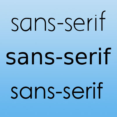
– Now that you know what serifs are, you’ve probably already guessed that sans-serif fonts are simply those fonts whose letters have no serifs – and you’d be absolutely right. The only prerequisite for joining the sans-serif club is that the strokes of your letters end with no curves, flourishes, embellishments, etc. Sans-serif fonts are typically used when there is a lot of text to read, as they are easiest on our eyes. Below are a few examples of sans-serif fonts.
Script
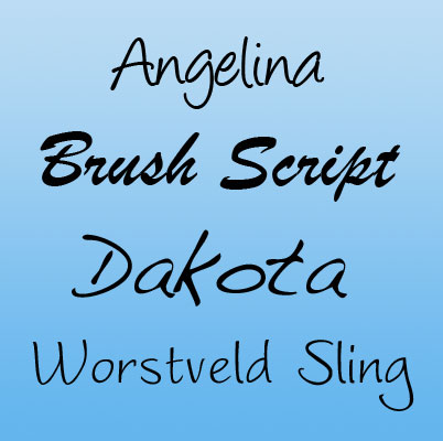
– Script fonts either appear to have been written by hand (also known as “handwritten fonts”) or have their letters connected, as in cursive or calligraphic style. A few examples are below.
Decorative
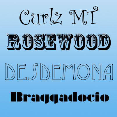
– These fonts, also known as Novelty, Ornamental or Fantasy fonts, are meant to be decorative in nature and are not to be used for large amounts of text. Decorative fonts sometimes incorporate pictures into each letter, as seen below. Beware the overuse of decorative fonts!
You Gotta Ask Yourself…
Below are a few questions you might find helpful to yourself when you’re deciding what font to use for your website.
Who is my audience?
This is the single biggest question you must face when choosing a font. For example, are you trying to portray something hip and young, or something wiser and more established? Do you want a font that is based on a specific theme, such as flowers or a Space Odyssey – or do you want a very formal look instead? Some fonts are quite plain while others are endlessly decorative. Some are very serious, while others are more playful and even humorous. And then there’s everything in between. By defining what you want the font to communicate on an emotional level, you should easily be able to tell whether or not a font will be a good choice for your website.

How much text will be read in this font?
For sections of your site where you have a lot of text, it’s important to choose a font that is easily readable. It’s especially important to be mindful of this on the web as text on a screen is at a lower resolution (72 dots per inch) than text on a printed page (anywhere from 500-2,000 dots per inch). I would recommend using a sans-serif font for your body text, or if you are going to use a serif font, choose a simple one, and make sure you use a large enough font size so that the text is easily readable. However, if you are choosing a font for only a few words (such as the header of your site), you’ll have much better luck going with a font that has more character and personality, such as a serif, script, or decorative font. There’s a saying in the font world that some fonts are meant to be read while others are meant to be heard. Try to decipher this difference when browsing fonts.
The Dos and the Don’ts
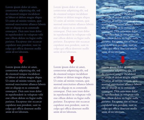
DO make sure your text is easily readable. As mentioned earlier, use an easy-to-read font for your body text such as a sans-serif or a simple serif font. Also, make sure you have enough contrast between your text color and your background color (dark text over a light background and vice versa). Avoid using patterns or photos behind text unless they are very subdued and don’t distract from your text. Remember, in the online world content is king!
DO use fonts to establish a visual hierarchy. A visual hierarchy is “the order in which the human eye perceives what it sees” (Wikipedia). In other words, it defines which words are most important and which are less so. Try varying font type, color, and size to communicate to your viewer which sections they should read first, second, and so on.
DO use Decorative fonts sparingly. These highly stylized fonts are like any rich dessert. A little goes a long way – and a lot would make anyone sick!
DO use consistency/repetition to keep your site unified. In other words, consider using the same font for all of your page headings, or for all of your navigational links. Of course, variety makes things interesting, but a little repetition lets the visitor know that every page is connected to one whole.
DON’T be a wimp. There is a general rule in the font world: keep it exactly the same or change it a lot. In other words, instead of using minute (i.e. wimpy) differences between fonts in their style, color or size – vary these elements greatly to create big contrast between the textual elements on your website.
DON’T pair two fonts that are similar – contrast is key. In accordance with what was stated just above, if you’re going to use two fonts on your website, make sure they are not from the same family (for example, don’t use two sans-serif fonts). There is no steadfast rule for why some fonts look good with others, but in general, you want them to have a certain amount of contrast, both in weight (thickness of strokes) and style/feel.
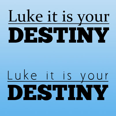
DON’T use too many different fonts on a site. I’d say use no more than three fonts on any given page. Sometimes two will suffice. We can use the rich indulgent dessert analogy again for this one. Two pieces of chocolate mousse pie = good. Six pieces = not so good.
DON’T use Comic Sans font. Ever.
Continue Down the Font Rabbit Hole…
Below are a few sites where you can find oodles of free fonts for download, most of them in TTF or OTF format (true-type-font and open-type-font). Keep in mind that setting up these fonts for use on your site will be up to you.
And if you are interested to learn more about typography, here are a few great resources:
Thanks for reading!

