When I revamped my website this year, one of the pages I knew I wanted to improve upon was my contact page. After all, this is where leads either take off 🚀 … or stop dead in their tracks 😵
In today’s blog, I’ll show you what I did and subsequently, how you can improve your contact page too 💡
Transparent Pricing
Although this won’t make sense for every business model, oftentimes being transparent about your prices on your contact page helps everyone! You’ll no longer waste your time on discovery calls with people who can’t or don’t want to pay you what you’re asking, and your prospects will no longer be put in that awkward situation where they’re on a call with you and everything is going great until they realize you’re way out of their budget.
Let Them Know When They’ll Hear Back
Telling visitors to your contact page exactly when they’ll hear from you after they submit your form conveys seriousness and professionalism (as long as you follow through!). My contact page says “I reply to all inquiries within 48 hours.”
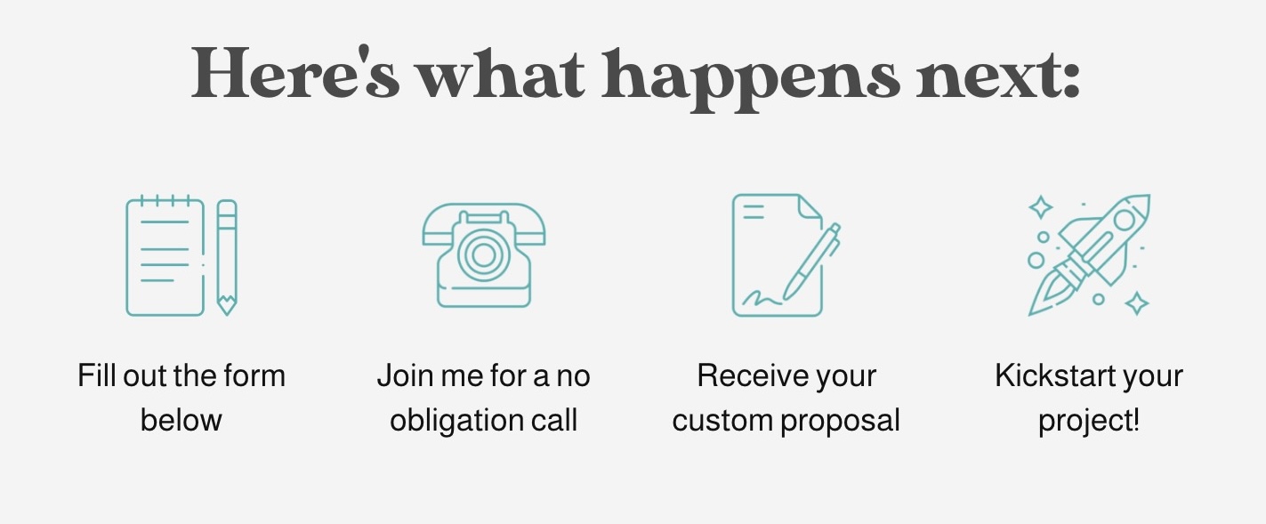
Tell Them What Happens Next
I love the graphic I made (shown below) that lets prospects know how things work and what to expect. It takes the mystery out of things and eases their mind, which is a good thing.
Make Your Form Short & Sweet
A good general rule of thumb for your inquiry form is to have just as many input fields as you need – no more and no less. My form (shown below) consists of eight fields, which are all pieces of information I need to have. Make sure that for every input field in your form, you know why you’re asking for it.
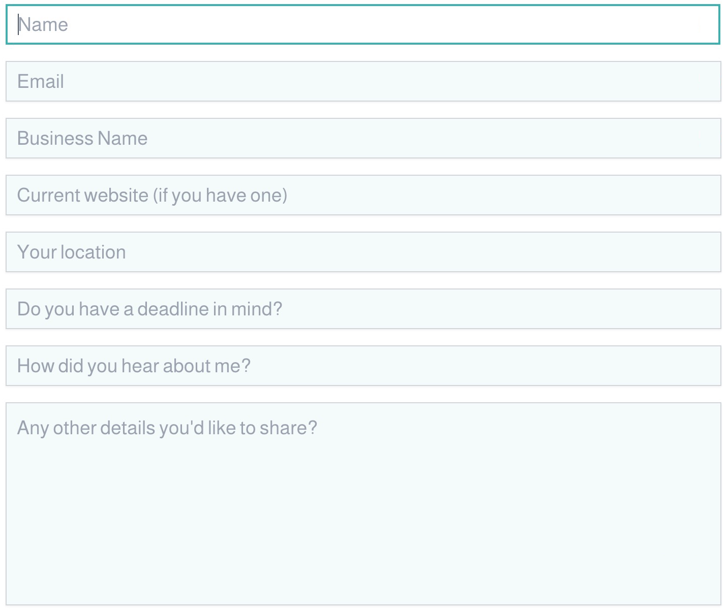
Ditch the (Input) Labels
Input labels are the names of each input field listed right ABOVE the input (i.e. Your Name or Your Email Address). The thing is, these days, it’s seldom necessary to have input labels because you can instead use placeholder text within the fields themselves to tell the user what to enter (see my form above to see what I mean). It makes for a form that’s cleaner, more elegant, and takes up far less vertical space. A good goal is to make sure your form can be viewed in its entirety on a phone without the user having to scroll.
In Summary
Your contact page is an extremely important part of your website, as is your contact form. Thus, we would do well to design and create these pieces with thought and care 💕 The five tips above are a great starting place for doing just that!