Most people don’t exactly *notice* websites. And why should you? Typically you go to one to look for something you need, and once you’ve found that thing, you leave. Done and done.
But when you’re a professional web designer, you sort of can’t help but notice how the website is for the user. Is it terrible? Is it just so-so? Is it AMAZING?
The sad reality is it’s pretty rare when I find myself on a website thinking “I LOVE this website!” But it does happen, and in fact, happened with the three websites below.
So here they are, as well as what I loved about each. If there’s a feature you want to put to good use on your own site, just holler and we’ll get it going for you!
1st Website I Love: Arbor Hills Animal Clinic
My little dog Hudson’s animal clinic recently redid their website, and when I went to it for the first time, I was delighted!
What I Love:
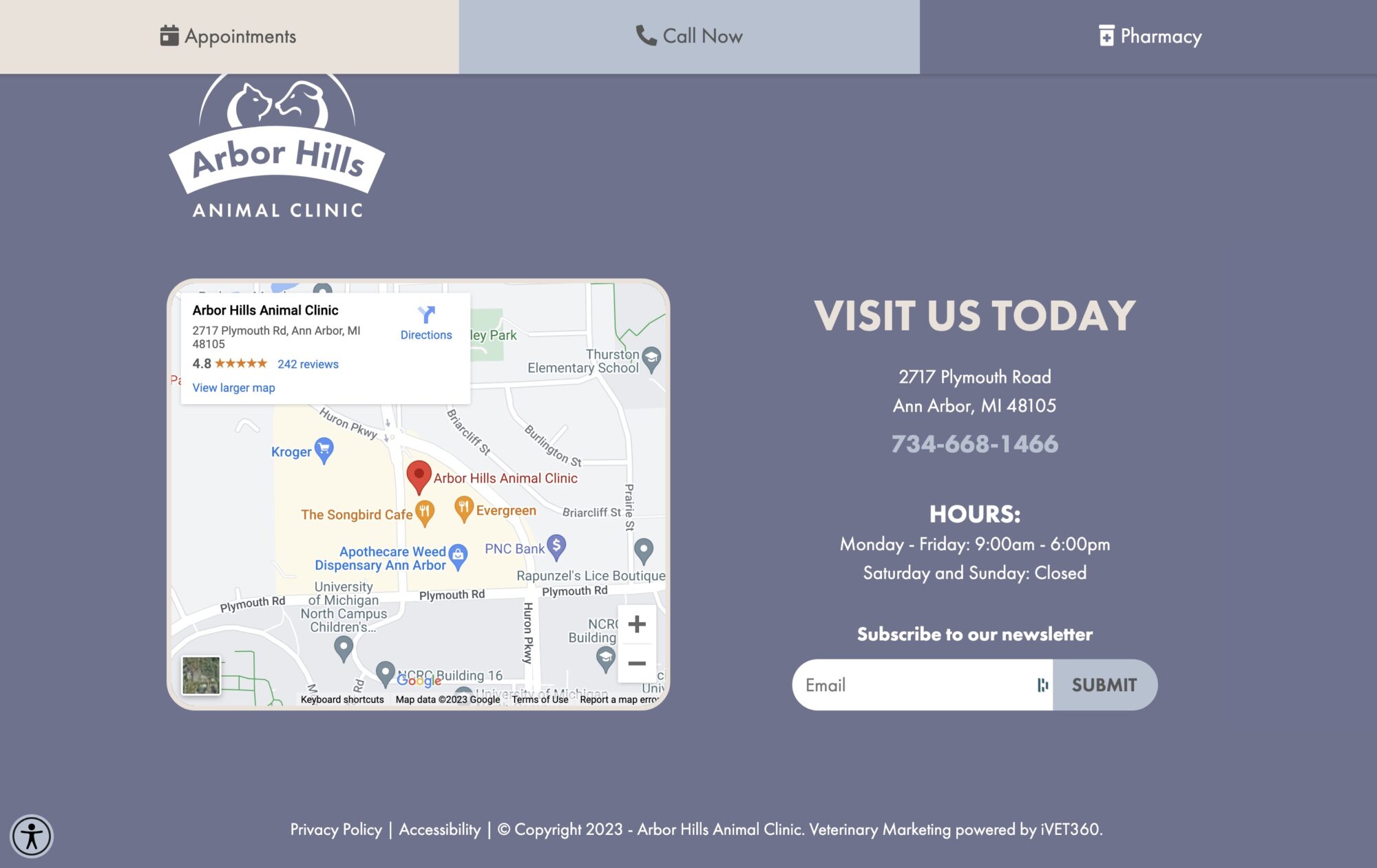
- Once you scroll down, three BIG buttons stay at the top of the page: Appointments, Call Now, and Pharmacy. They’ve prioritized the actions that are most important to users and made it so they’re always visible. Very smart.
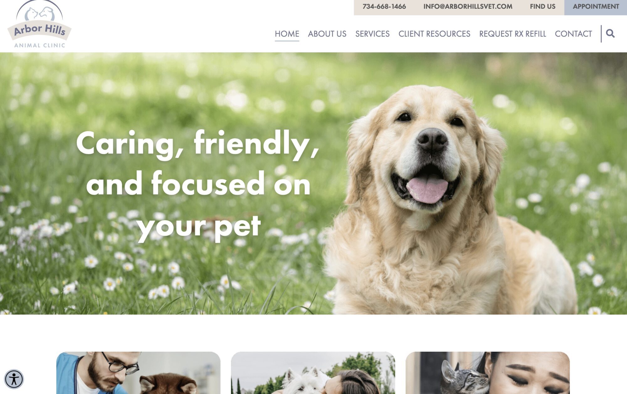
- The color scheme of blue/purple and shades of cream/brown exude both the calm and security you want to feel with a vet for your fur baby as well as the colors that animals tend to be. It just fits!
- LOTS of photos of cute animals everywhere you look. As it should be 😉
- I like that there is a menu heading called “Client Resources.” They clearly had me, the client, in mind when they designed the menu.
Visit the Arbor Hills Animal Clinic website.
2nd Website I Love: AsKevin
A friend of mine recently started working at AsKevin, a company that provides tech support for people of all ages. When I went to the AsKevin website to check them out, I found I loved it!
What I Love:
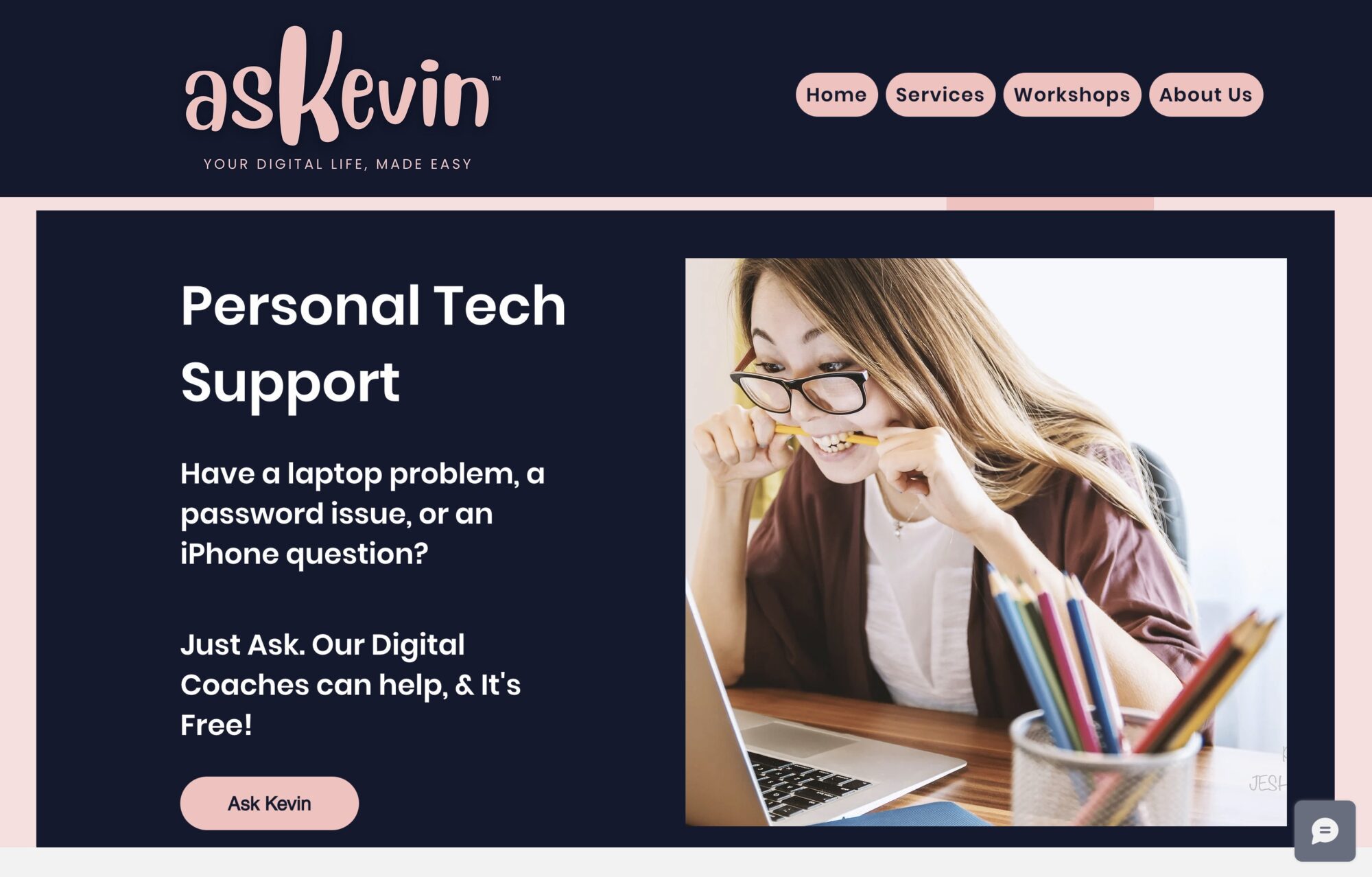
- The fonts are big and easy to read, which means they know who they’re speaking to – people who probably aren’t the most tech-literate folks.
- Right at the top of the homepage is “Have a laptop problem, a password issue, or an iPhone question? Just ask.” It’s super clear right off the bat what these people do and how they help.
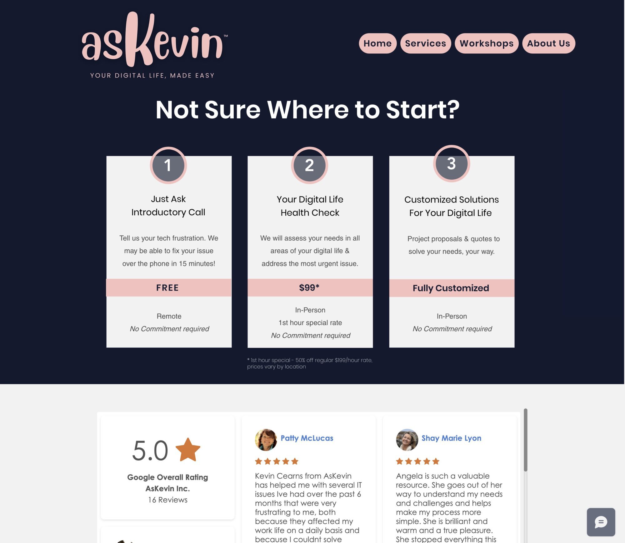
- Lots of testimonials and reviews all around the site make it clear that customers = happy.
- While the site uses primarily stock photos, all of the stock photos “fit” with one another, creating a consistent aesthetic, and diversity is well represented.
- Their tagline: Your life, your tech, your way. We all should strive for a tagline so concise, descriptive, and catchy!
- Their Google reviews are embedded right on the site, which will update as soon as they get new reviews without their having to update the site. Cool!
Visit the AsKevin website.
3rd Website I Love: Reading Partners (nonprofit)
In my work with a current nonprofit I’m designing a new website for, my client mentioned this website as one they loved and I found I loved it too, for lots of reasons.
What I Love:
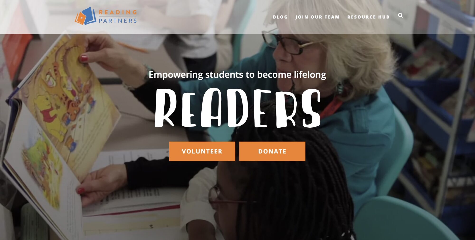
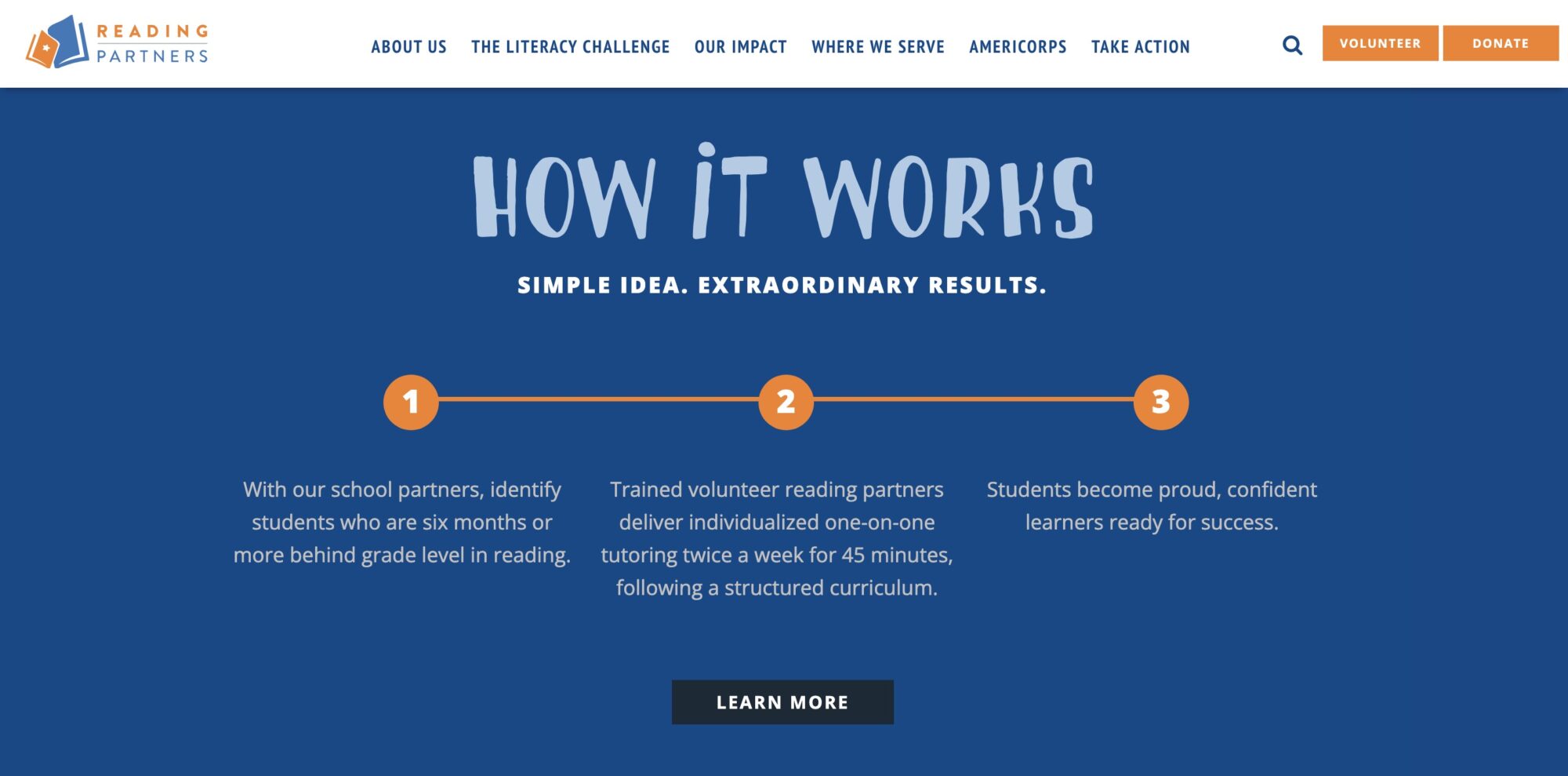
- The fonts and colors 100% align with the mission of the nonprofit and who they serve – children!
- The “How it Works” section on the homepage. I am a huge fan of breaking down what a business or organization does into three simple steps.
- The background video on the homepage is everything it should be: the clips switch frequently so you can see lots of different people before you’ve even scrolled down the page, it shows both kids and their reading partners having FUN, and the nonprofit’s mission is reflected in a visual way. A picture is worth 1,000 words and a video is worth 1,000 pictures.
- The sticky stay-in-place menu at the top allows a user to click “volunteer” or “donate” at ANY time. They’ve prioritized their primary call-to-actions.
- The statistics under “Our Work” and “Our Impact” on the homepage show you in very real terms how they’re making a difference.
Visit the Reading Partners website.
In Closing
Landing on a website that works well, makes for a great user experience, and is beautiful to boot is a wonderful thing! If you saw any features on the above three that you’d like to put to use on your own site, reach out and let’s chat. The sky is the limit.
Looking for more?
Here are some other posts from Janelle at Ellanyze (that’s me!) on website inspiration.
Website Homepage Ideas: 3 Designs That Will Inspire You
Five Companies That Display Their Core Values Perfectly on Their Website
Website Contact Forms 101: Must-Have Tips + Examples We Love
3 Website Footers I Love & Why
5 Best Contact Us Pages & What We Love About Each

